Guide · React Dashboard UI
How to Build a React Dashboard
A dashboard is only useful if people believe what it shows. This guide builds one in React and Tailwind: the layout, KPI cards, charts, a filterable table, and the loading, empty and error states most dashboards forget.
· 9 min read
Start from the questions it answers
The usual way to build a dashboard is to pick a grid template and fill the boxes. The result looks busy and answers nothing. A better starting point is the three or four questions the person opening it actually has: are we growing, who needs attention, and what changed since I last looked.
Each question maps to one part of the page. Growth is a row of KPI cards and a trend chart. Who needs attention is a table you can filter. What changed is the comparison every number carries. The rest of this guide builds those parts, using Layro's React dashboard components.
Install the components
The chart, table, badge and state components are free. Install them with the shadcn CLI:
npx shadcn@latest add https://layropro.com/r/chart https://layropro.com/r/data-table https://layropro.com/r/badge https://layropro.com/r/stateThe Sidebar and Filter Builder come with a Layro licence. Once the @layro registry is set up in components.json, they install by name:
npx shadcn@latest add @layro/sidebar @layro/filter-builderEach component is one file in components/ui, so you can read it and change it like your own code.
The layout: a sidebar and a scrolling page
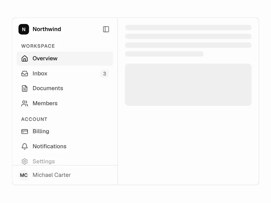
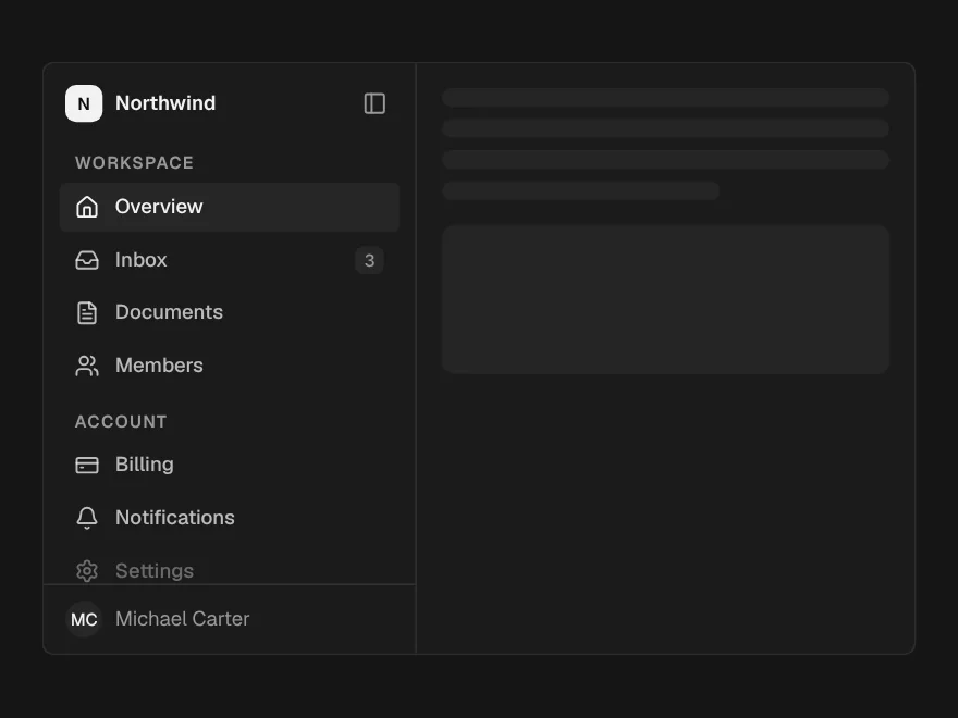
Most dashboards share one shape: navigation on the left, the page on the right, and only the page scrolls. The Sidebar handles the navigation. Passing onCollapsedChange adds the button that folds it to an icon rail, and in the rail every item keeps its name as a tooltip, because an icon without a label is a guess.
"use client";

import * as React from "react";
import Link from "next/link";
import { usePathname } from "next/navigation";
import { CreditCard, LayoutDashboard, Users } from "lucide-react";
import { Sidebar, SidebarGroup, SidebarItem } from "@/components/ui/sidebar";

const NAV = [
  { href: "/dashboard", label: "Overview", icon: <LayoutDashboard /> },
  { href: "/dashboard/customers", label: "Customers", icon: <Users /> },
  { href: "/dashboard/billing", label: "Billing", icon: <CreditCard /> },
];

export function DashboardShell({ children }: { children: React.ReactNode }) {
  const pathname = usePathname();
  const [rail, setRail] = React.useState(false);

  return (
    <div className="flex h-dvh">
      <Sidebar collapsed={rail} onCollapsedChange={setRail} className="border-r border-border">
        <SidebarGroup label="Workspace">
          {NAV.map((item) => (
            <SidebarItem
              key={item.href}
              icon={item.icon}
              active={pathname === item.href}
              render={(props) => <Link {...props} href={item.href} />}
            >
              {item.label}
            </SidebarItem>
          ))}
        </SidebarGroup>
      </Sidebar>

      <main className="min-w-0 flex-1 overflow-y-auto p-6">{children}</main>
    </div>
  );
}
The render prop hands each item to Next.js's Link, so navigation stays client-side. The active item gets aria-current="page", which screen readers announce. Note min-w-0 on the main area: without it, a wide table pushes the page sideways instead of scrolling inside its own box.
KPI cards that compare honestly
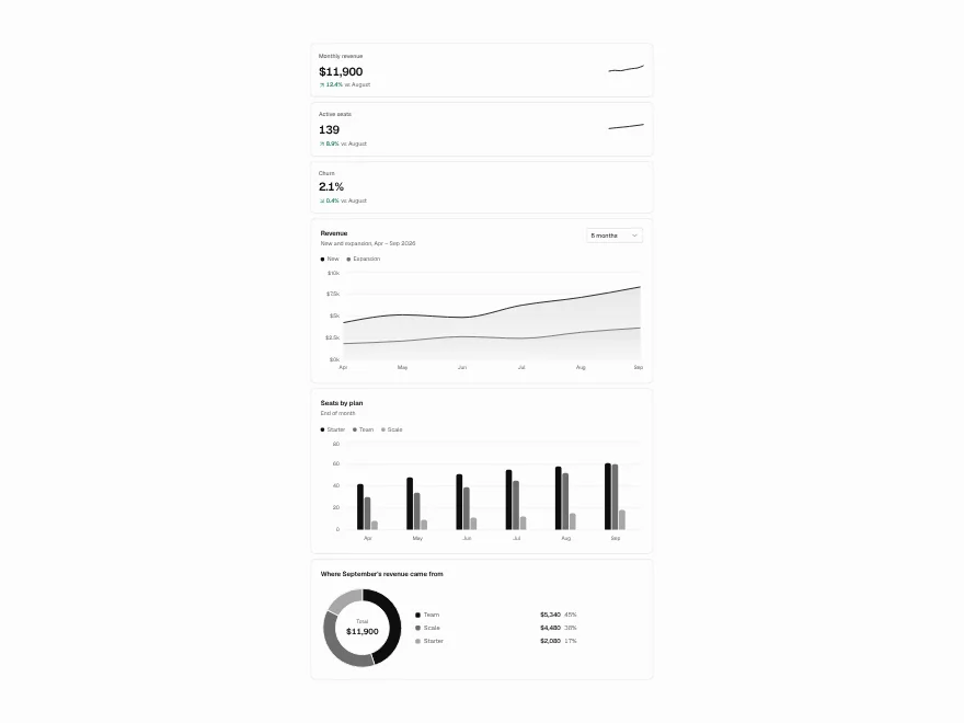
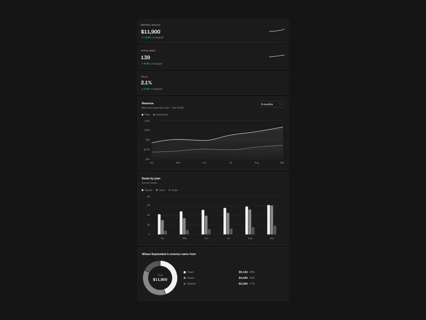
A number on its own tells nobody anything. “$48,210” is only good or bad against something, so every KPI card should say what it is compared with.
import { KpiCard } from "@/components/ui/chart";

<div className="grid gap-4 sm:grid-cols-2 lg:grid-cols-4">
  <KpiCard label="Revenue" value="$48,210" delta={0.124} period="vs last month" trend={revenueByWeek} />
  <KpiCard label="Active customers" value="1,284" delta={0.031} period="vs last month" />
  <KpiCard label="Churn" value="2.4%" delta={0.12} good="down" period="vs last month" />
  <KpiCard label="Open invoices" value="37" delta={-0.08} good="down" period="vs last week" />
</div>
delta is a fraction, so 0.124 reads as 12.4%. period prints what it compares against, next to the change. The detail most dashboards get wrong is the colour. Up is not always good: churn and open invoices going up is bad news. Setting good="down" turns a rise red and a fall green for those cards. The direction is also spoken as “Up” or “Down” for screen readers, so it does not depend on colour. trend adds a small sparkline when the shape of the last few weeks matters more than one comparison.
Charts people can read
The Charts component is Recharts with a few firm rules on top, and the rules are what make a chart readable instead of decorative:
- Colour follows the series, not its rank. Each series takes a fixed slot (
--chart-1to--chart-5), so hiding one never repaints the others. - One y-axis, always. Two measures of different scale belong in two charts.
- Thin marks and a quiet grid, so the data is the loudest thing on the card.
- Two or more series get a legend, and every chart carries a tooltip and a hidden data table, so nothing depends on colour or hover.
import { AreaTrend, ChartCard } from "@/components/ui/chart";

<ChartCard title="Revenue" subtitle="Last 12 weeks">
  <AreaTrend
    data={weekly}
    xKey="week"
    series={[
      { key: "newRevenue", label: "New", slot: 1 },
      { key: "expansion", label: "Expansion", slot: 2 },
    ]}
    format={(v) => "$" + v.toLocaleString()}
    description="Weekly revenue from new and expanding customers, rising from $9,800 to $12,400 over 12 weeks."
    stacked
  />
</ChartCard>
description is required. It is read out before the data table, so write it as the one sentence you would say about the chart to someone who cannot see it. BarCompare takes the same props for comparisons between categories, and DonutBreakdown shows parts of a whole.
The data table
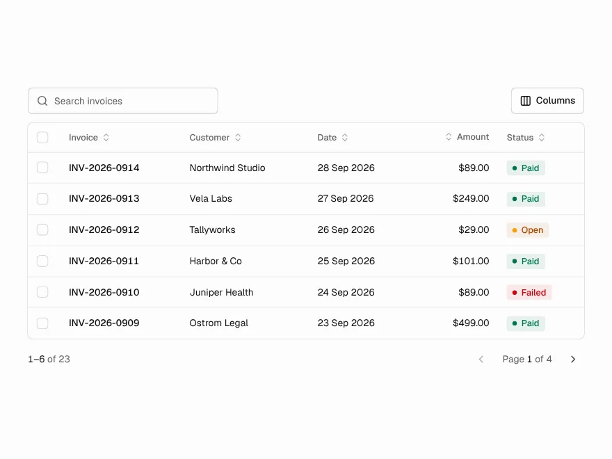
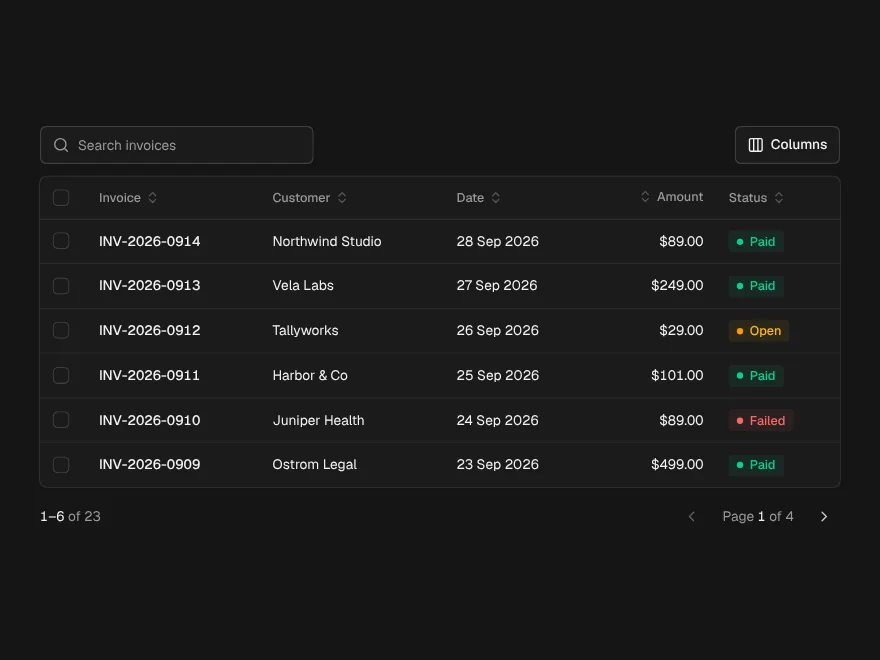
The table is where people act, so most of the work goes here. Data Table is TanStack Table underneath. You describe the columns, and it adds sorting, search, row selection, bulk actions, a columns menu and pagination.
import { DataTable, type ColumnDef } from "@/components/ui/data-table";
import { Badge } from "@/components/ui/badge";
import { Button } from "@/components/ui/button";

type Customer = {
  id: string;
  name: string;
  plan: "Starter" | "Team" | "Business";
  status: "active" | "trial" | "past_due";
  mrr: number;
};

const STATUS = {
  active: { tone: "success", label: "Active" },
  trial: { tone: "info", label: "Trial" },
  past_due: { tone: "warning", label: "Past due" },
} as const;

const columns: ColumnDef<Customer>[] = [
  { accessorKey: "name", header: "Customer" },
  { accessorKey: "plan", header: "Plan" },
  {
    accessorKey: "status",
    header: "Status",
    cell: ({ getValue }) => {
      const s = STATUS[getValue<Customer["status"]>()];
      return <Badge tone={s.tone} dot>{s.label}</Badge>;
    },
  },
  {
    accessorKey: "mrr",
    header: "MRR",
    meta: { align: "right" },
    cell: ({ getValue }) => "$" + getValue<number>().toLocaleString(),
  },
];

<DataTable
  data={customers}
  columns={columns}
  label="Customers"
  getRowId={(c) => c.id}
  searchPlaceholder="Search customers"
  selectable
  bulkActions={(rows) => (
    <Button size="sm" variant="outline">Export {rows.length}</Button>
  )}
  columnToggle
/>
A few choices in there are worth copying:
- Numbers are right-aligned with
meta: { align: "right" }, so the digits line up and amounts can be compared at a glance. - Status is a Badge with a word and a tone, never colour alone. The
dotmarks a state that can change. getRowIdgives rows stable ids, so a selection survives sorting and searching.labelnames the table for screen readers, and sortable headers announce their direction.
Filters people can read back
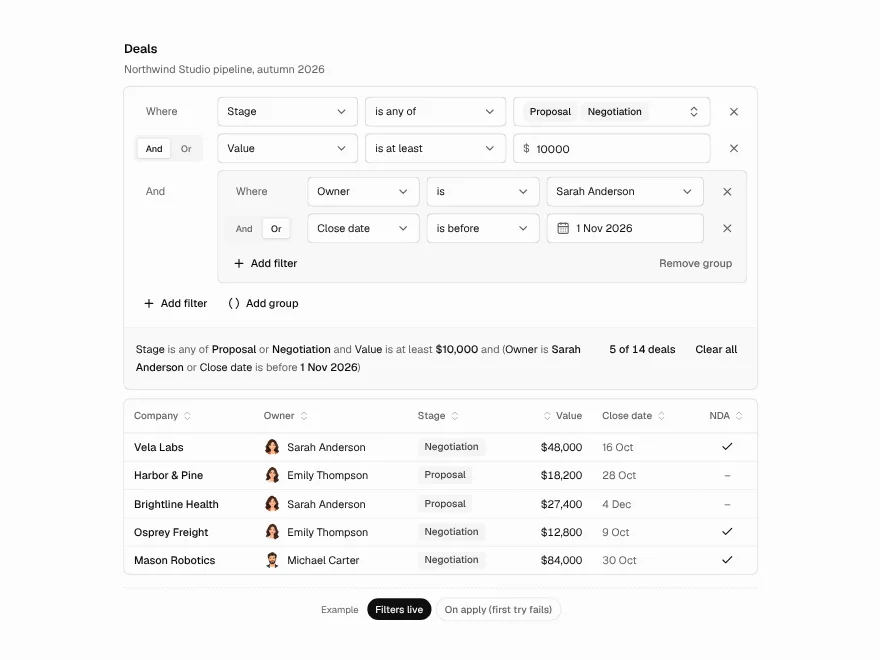
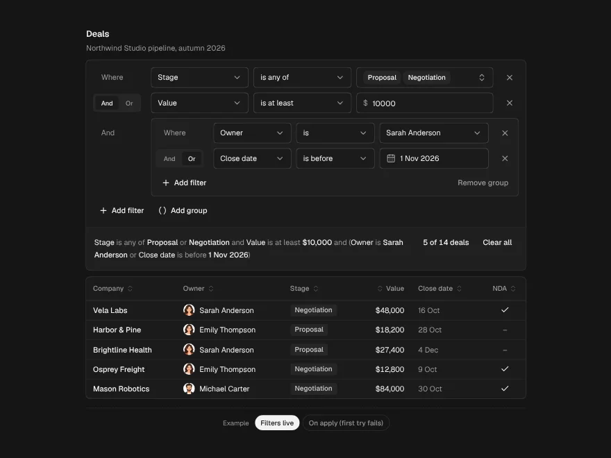
Search finds one row. Filters answer questions like “which Business customers pay under $500?”. The Filter Builder builds those conditions row by row and reads the whole filter back as a plain sentence, next to how many rows it leaves. A filter people cannot read back is a filter they do not trust.
import { FilterBuilder, applyFilter, type FilterField, type FilterGroup } from "@/components/ui/filter-builder";

const fields: FilterField<Customer>[] = [
  {
    id: "plan",
    label: "Plan",
    type: "select",
    options: [
      { value: "Starter", label: "Starter" },
      { value: "Team", label: "Team" },
      { value: "Business", label: "Business" },
    ],
  },
  { id: "mrr", label: "MRR", type: "number", prefix: "$" },
];

const [filter, setFilter] = React.useState<FilterGroup>({ id: "root", conjunction: "and", items: [] });
const rows = applyFilter(customers, filter, fields);

<FilterBuilder
  fields={fields}
  value={filter}
  onChange={setFilter}
  noun="customers"
  resultCount={rows.length + " of " + customers.length + " customers"}
/>

<DataTable data={rows} columns={columns} label="Customers" />
Each field's type decides which operators are offered and which editor the value gets. A condition without a value yet is treated as unfinished rather than wrong: applyFilter ignores it, so the table never empties while someone is still typing.
Loading, empty and error states
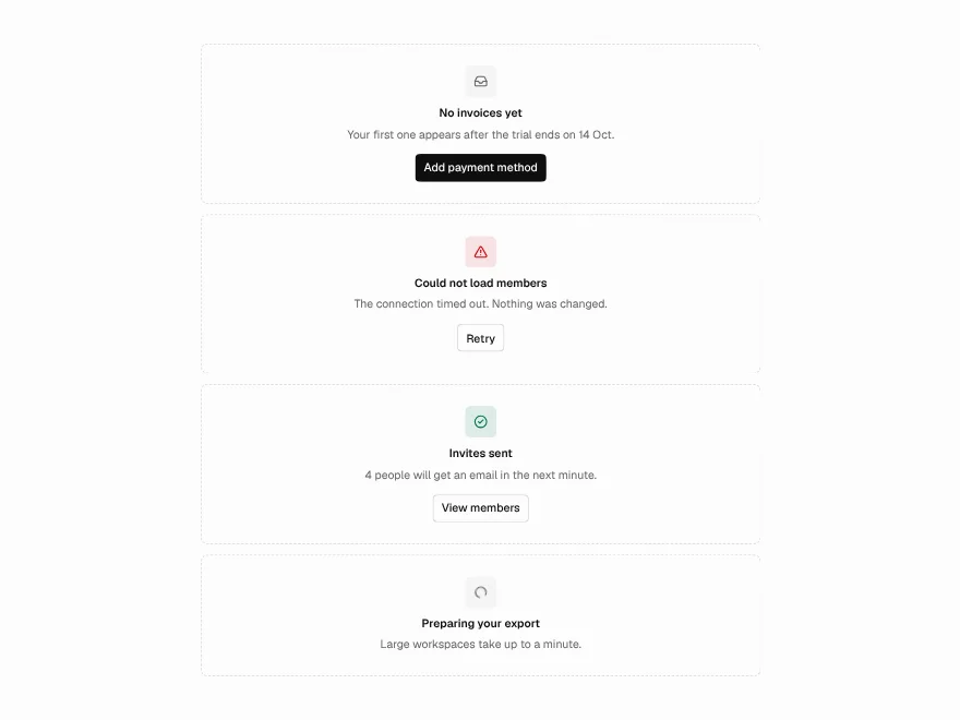
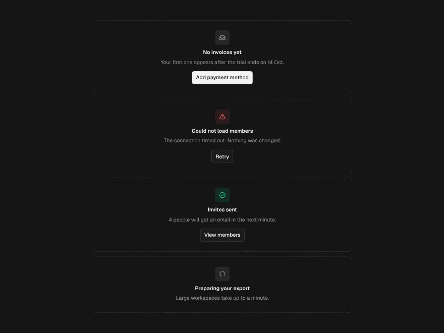
These are the screens nobody designs until they ship broken, and they are the ones that decide whether people trust the numbers. A dashboard that shows $0 while it loads, or an empty table when the request failed, is telling them something false.
import { Skeleton, State } from "@/components/ui/state";

if (status === "loading") {
  // Shaped like the four KPI cards it stands in for.
  return (
    <div className="grid gap-4 sm:grid-cols-2 lg:grid-cols-4" aria-busy>
      {[0, 1, 2, 3].map((i) => (
        <Skeleton key={i} className="h-[104px] rounded-[14px]" />
      ))}
    </div>
  );
}

if (status === "error") {
  return (
    <State
      kind="error"
      title="Revenue could not be loaded"
      description="The billing service did not answer. Nothing was lost; try again in a moment."
      action={<Button onClick={retry}>Retry</Button>}
    />
  );
}

if (customers.length === 0) {
  return (
    <State
      kind="empty"
      framed
      title="No customers yet"
      description="Customers appear here after their first checkout."
      action={<Button>Share your checkout link</Button>}
    />
  );
}
Each state has one job:
- Loading. A
Skeletonshaped like the content it replaces makes the wait feel shorter than a spinner does, and the layout does not jump when the data arrives. - Error. Say what failed in plain words and offer Retry. The error State is announced to screen readers as an alert.
- Empty. Say what goes here and give the one action that fills it. An empty dashboard on day one is a new customer, not a failure.
Keep “nothing yet” and “nothing matches” apart. The table's empty prop is for the second, inside the table, with a hint to clear a filter. The page-level State is for the first.