React Form Components
Every form control on one size and spacing scale, so a settings page and a checkout look like the same product. Field wires a label, hint, error and required marker to whatever control sits inside it.
Built on Radix UI, react-day-picker and Tiptap where those do the hard part, with keyboard support and screen reader labels throughout.
13 components, 13 free. React, TypeScript and Tailwind CSS, light and dark.
Button
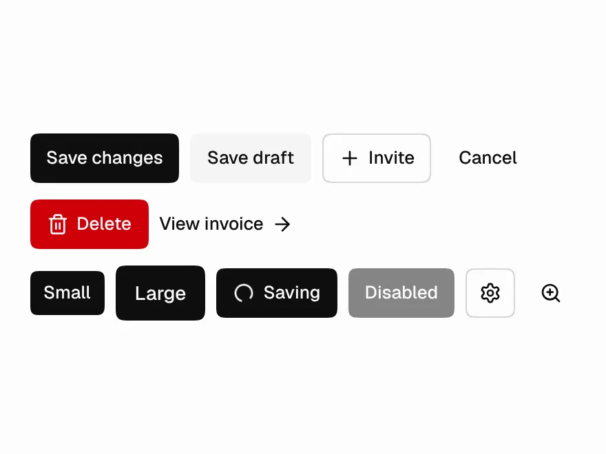
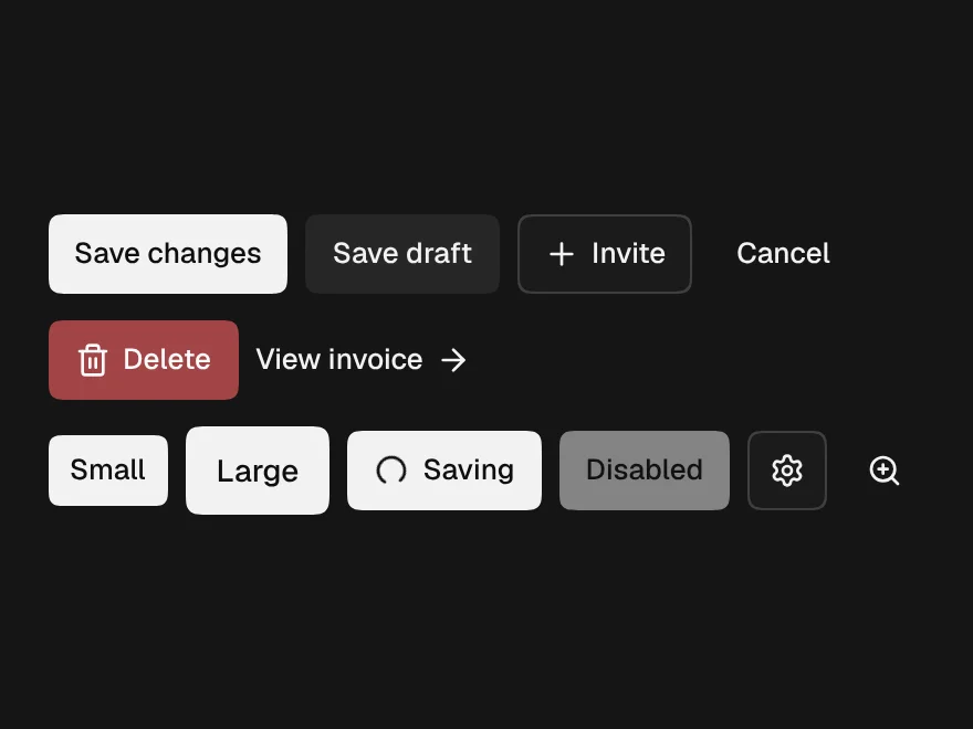
FreeSix variants, three sizes, a loading state that keeps its width, and an icon button that insists on a label.
Field
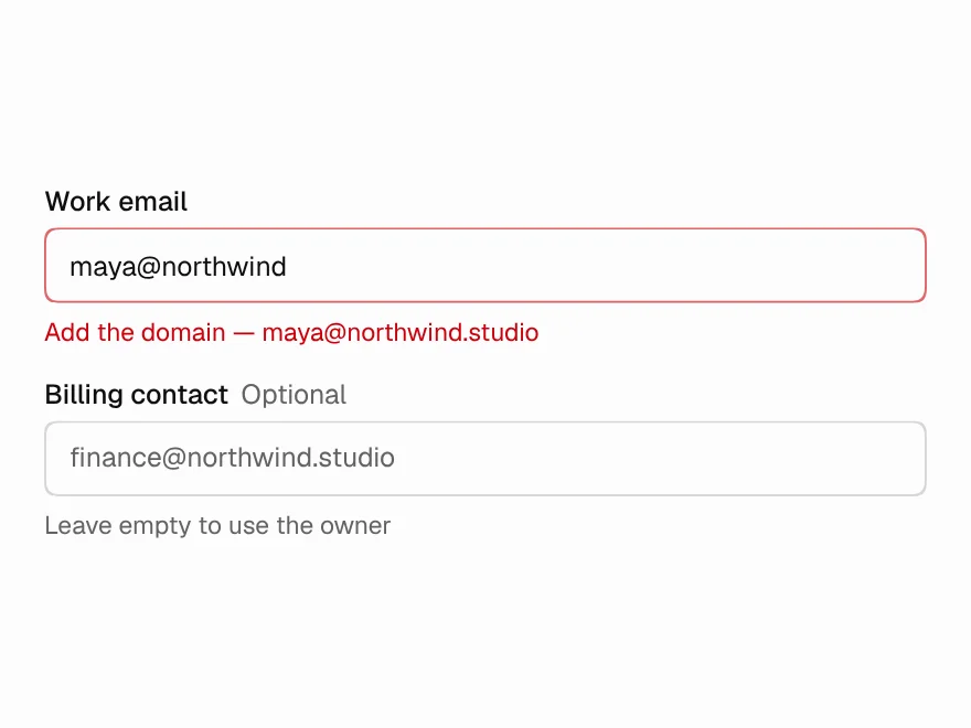
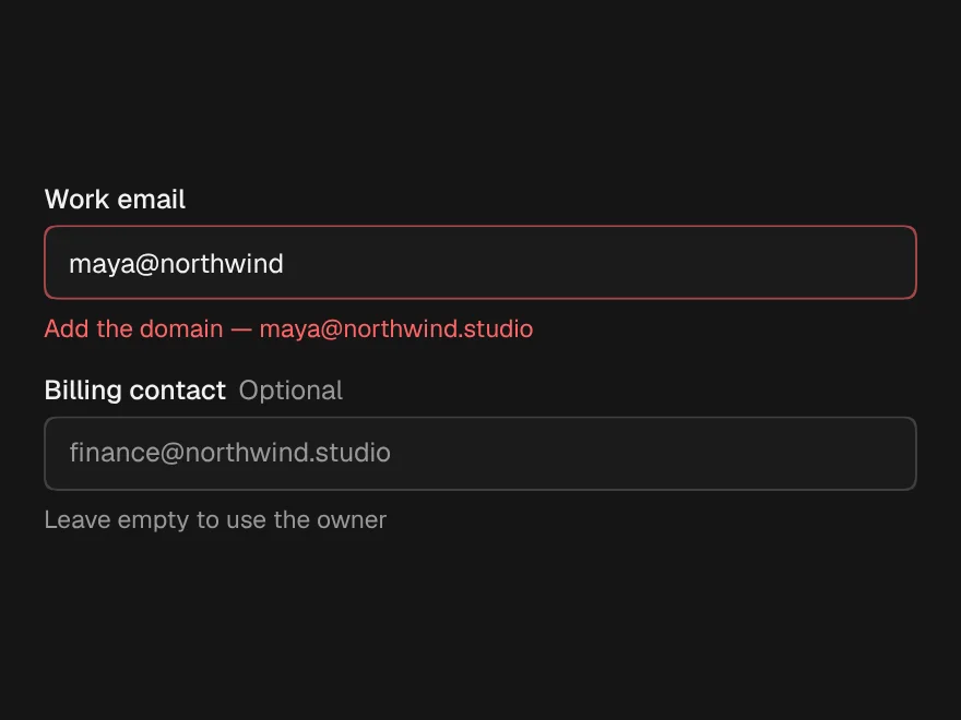
FreeLabel, hint, error and required marker, wired to whatever control is inside it.
Input
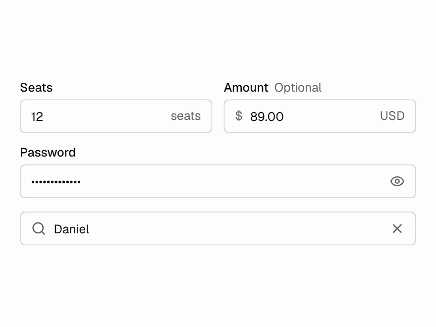
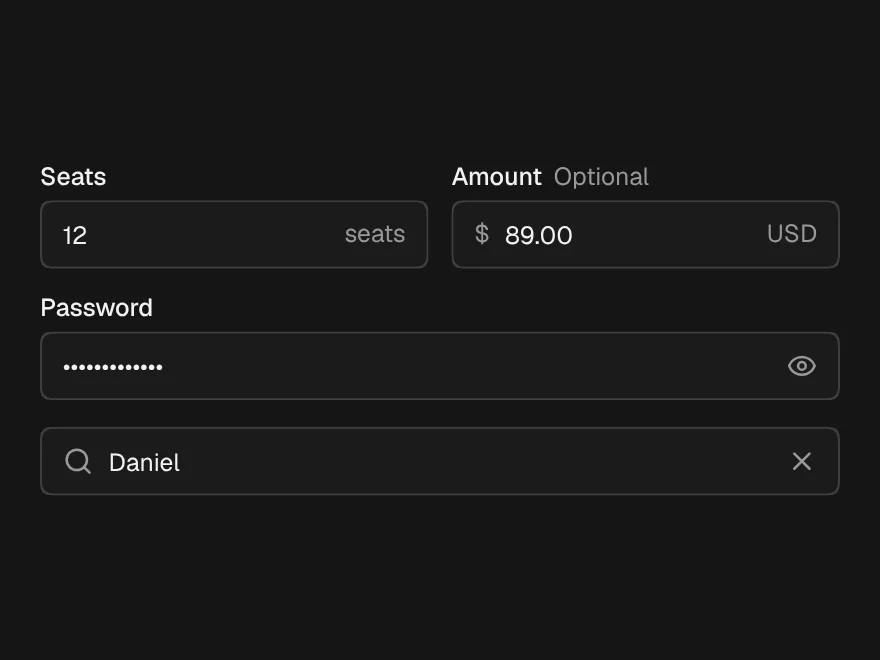
FreeText input with prefix and suffix, plus Password with a reveal toggle and Search that clears on Escape.
Textarea
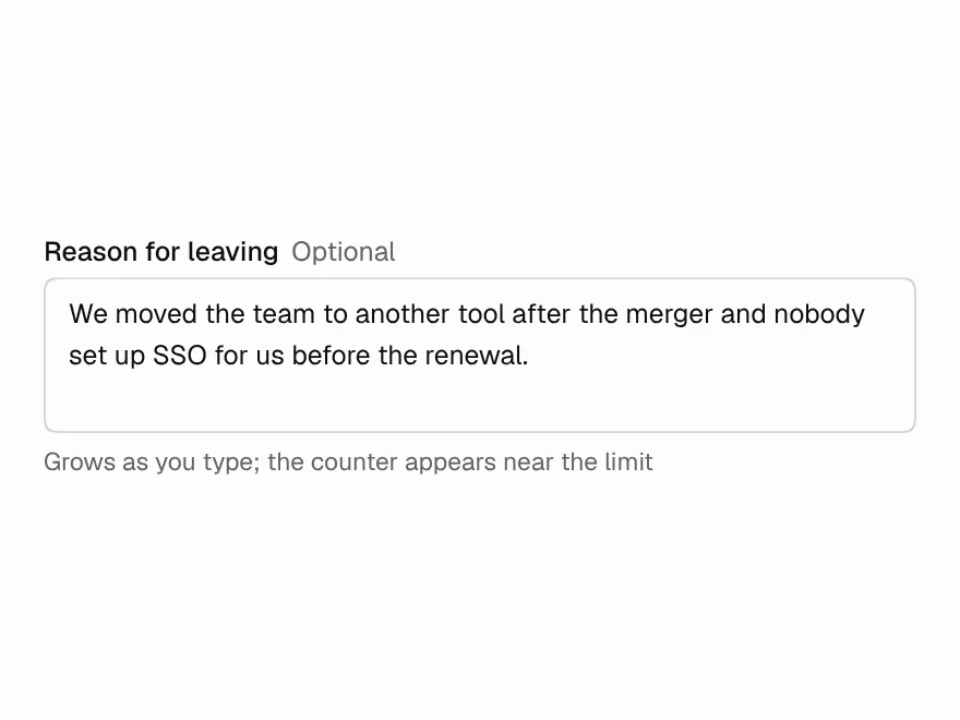
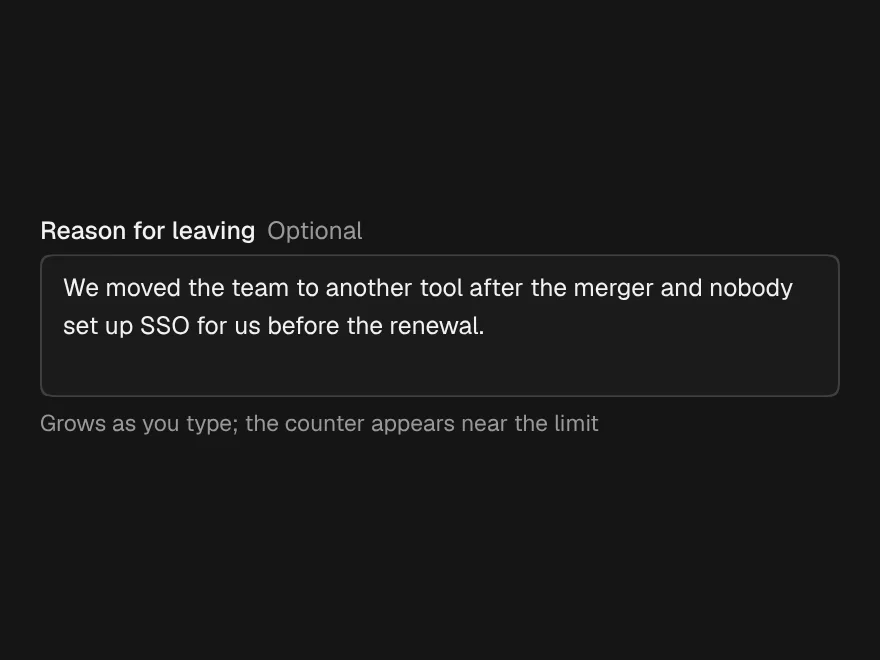
FreeGrows with its content up to a limit, and shows a counter only when the limit is close.
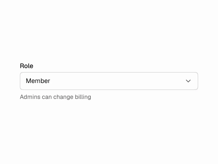
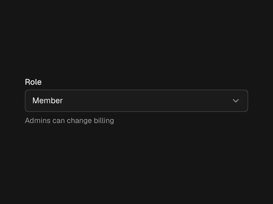
Select
FreeRadix select on the Layro surface, with a hint line per option and disabled items.
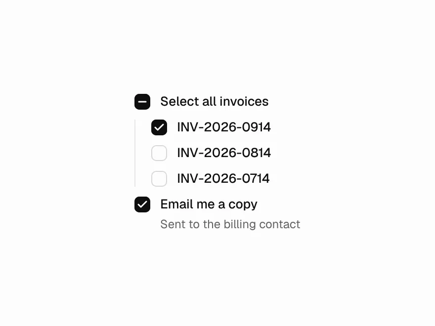
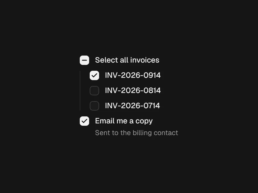
Checkbox
FreeChecked, unchecked and the indeterminate 'some of these' state.
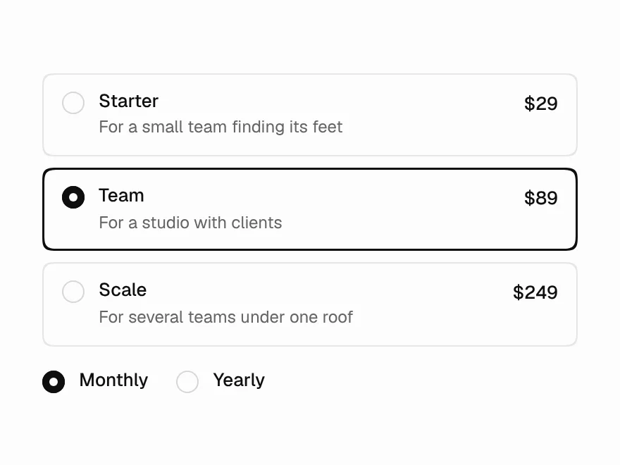
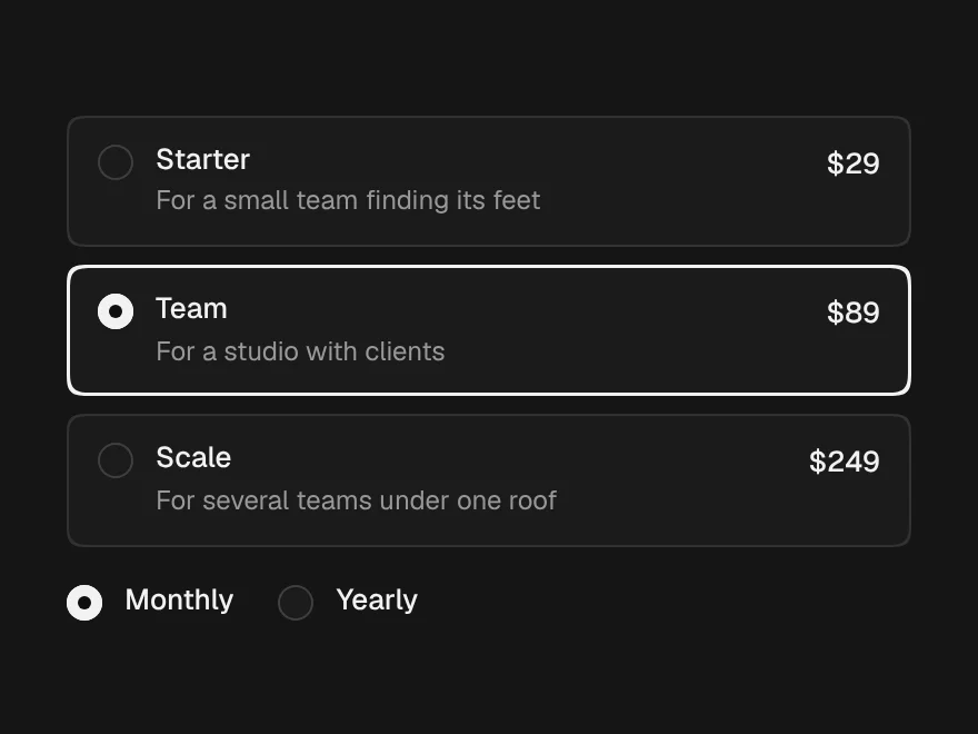
Radio Group
FreePlain radios or selectable cards with a hint and a price, with arrow keys that select.
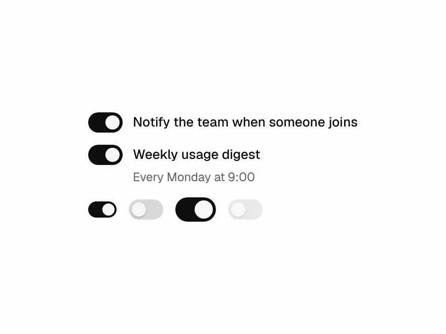
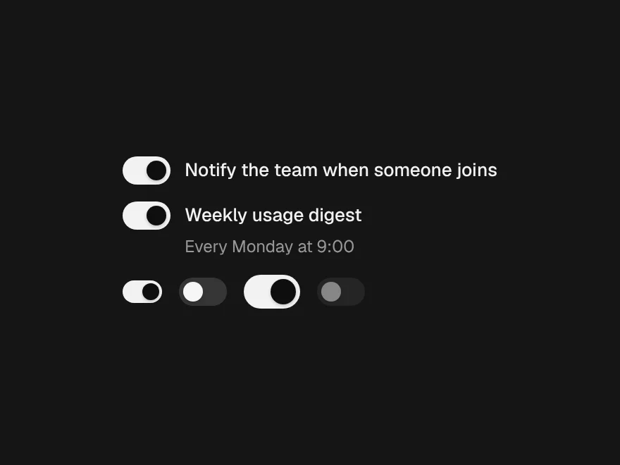
Switch
FreeAn on/off control in three sizes, labelled by its Field.
Combobox
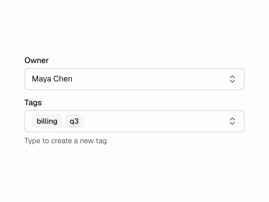
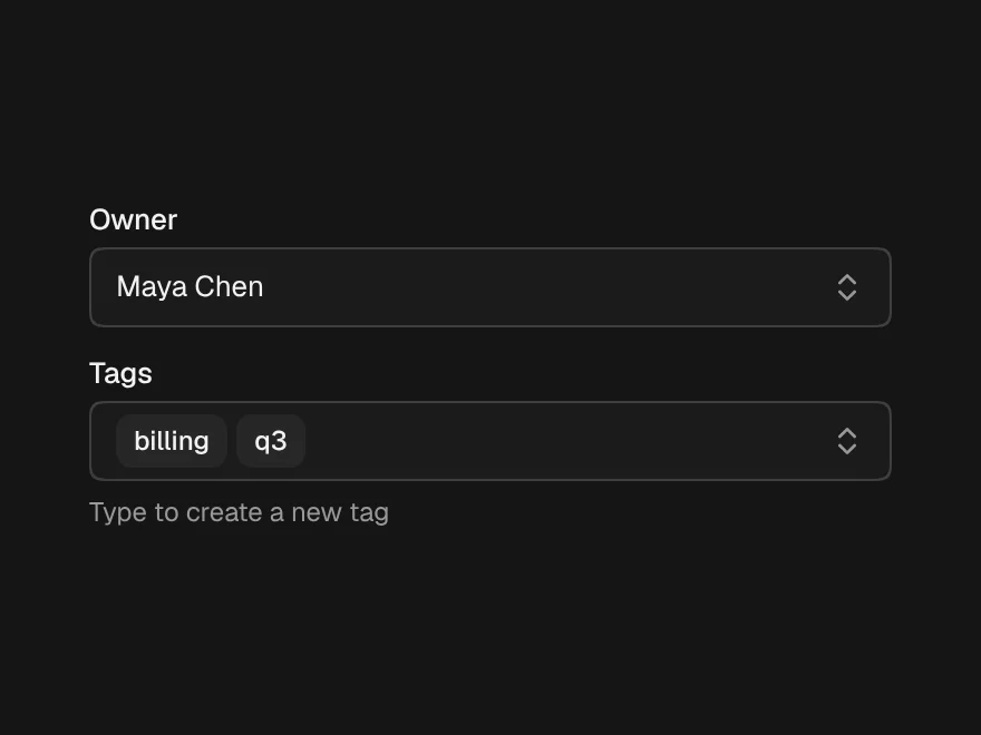
FreeSearchable single or multiple select, with creatable options and hints.
Calendar
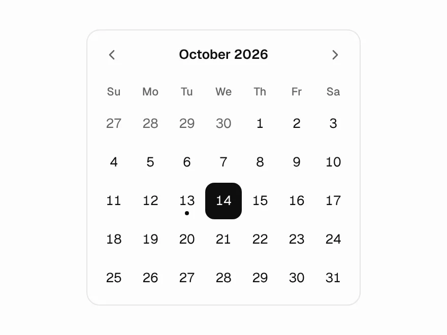
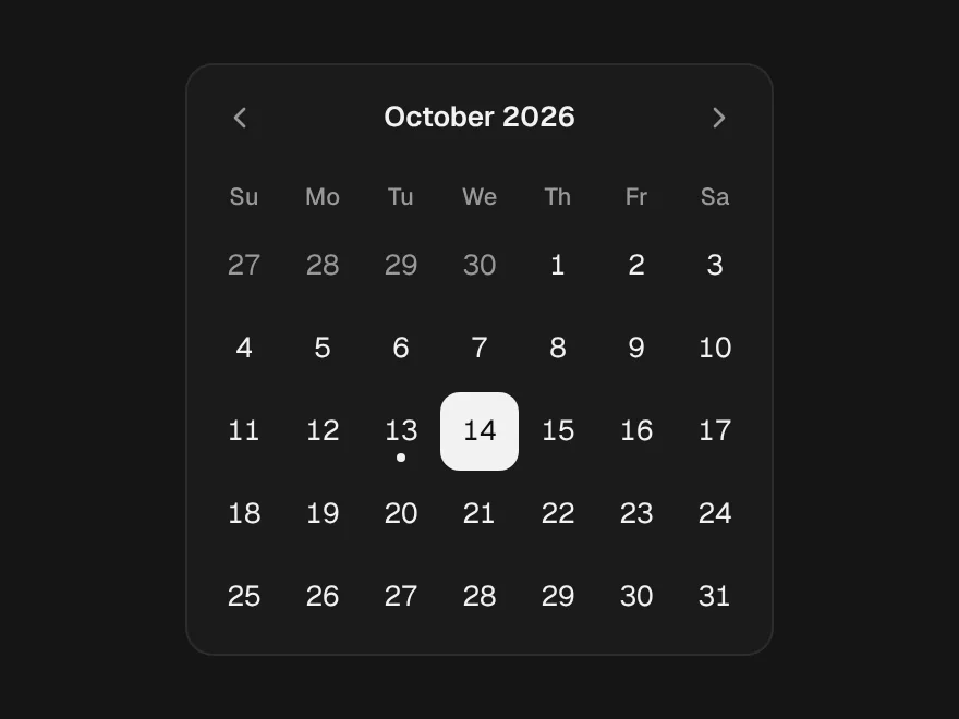
FreeA month grid on react-day-picker 9, in the Layro look, with disabled days and ranges.
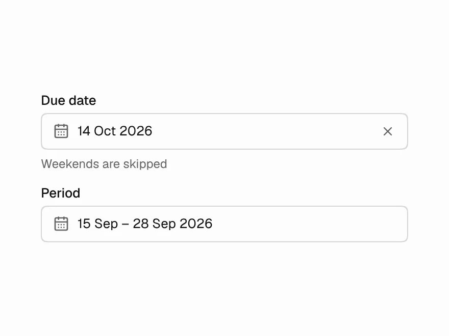
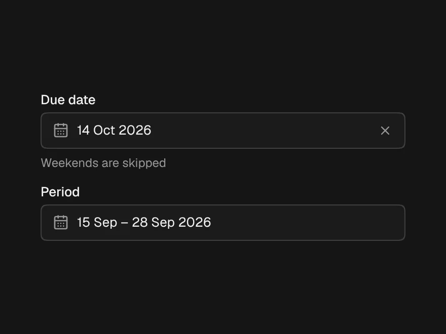
Date Picker
FreeSingle date and date range in a popover, with presets and a clear button.
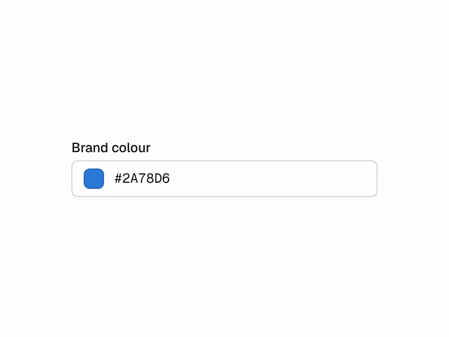
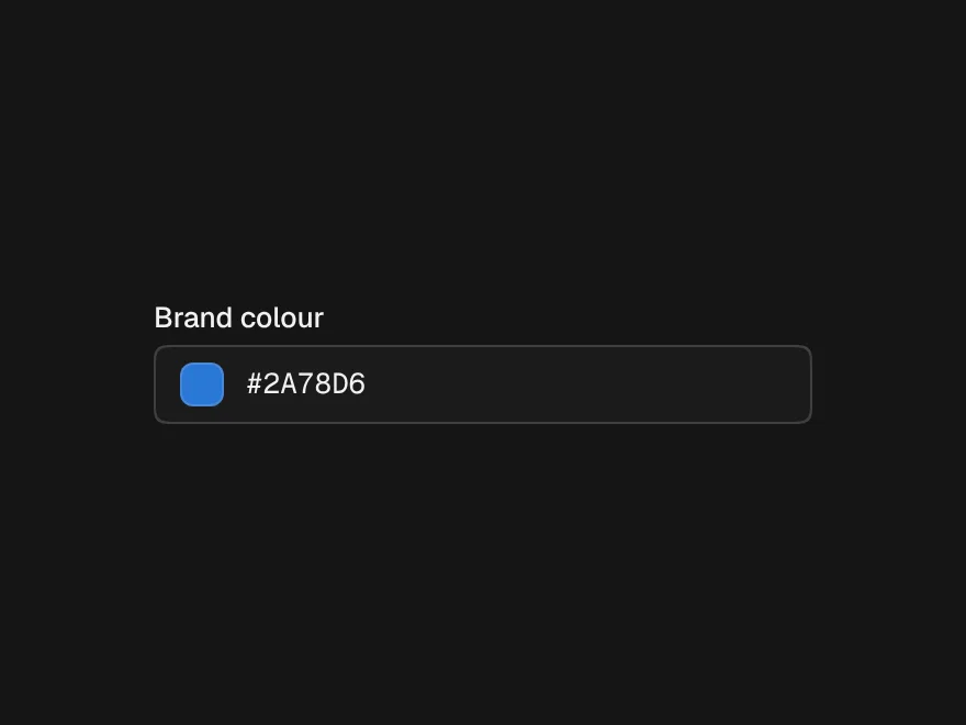
Color Picker
FreeSaturation area, hue slider, swatches and a hex field that accepts shorthand.
Rich Text Editor
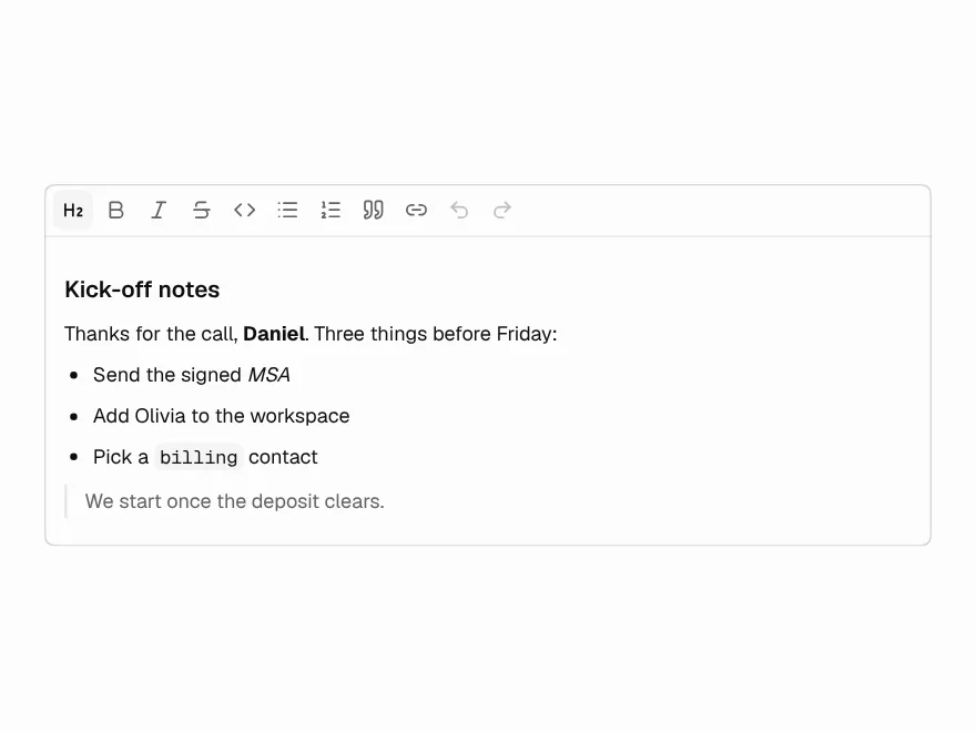
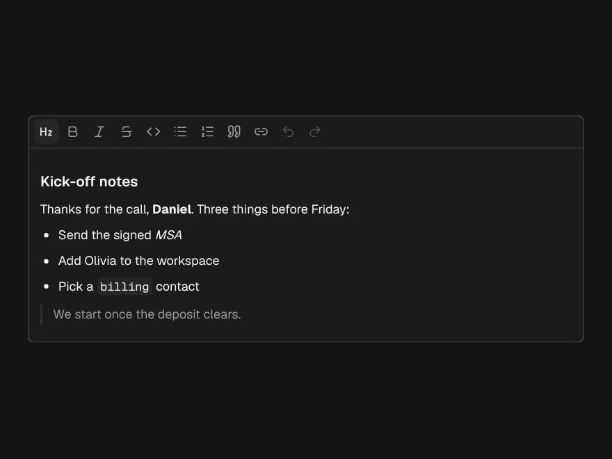
FreeTiptap editor with a keyboard-friendly toolbar, inline link field and character count.