React Navigation and Layout Components
The structure around your screens: a sidebar that collapses to an icon rail, tabs with counts, pagination that fits small screens, and a stepper with optional and error steps.
Plus an accordion, a tree view with the full ARIA keyboard model, and split panes you can resize by dragging or with the keyboard.
7 components, 6 free. React, TypeScript and Tailwind CSS, light and dark.
React dashboard components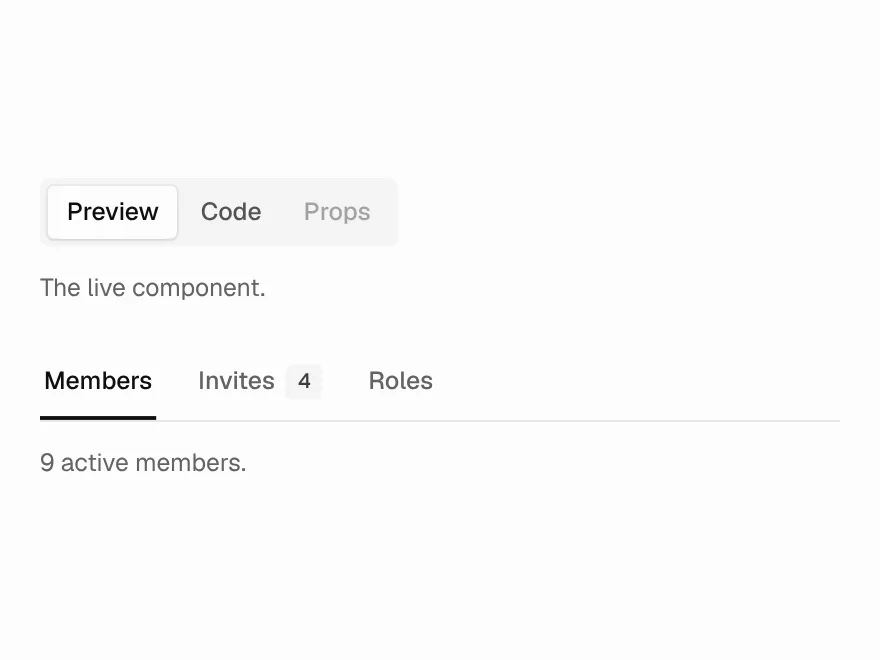
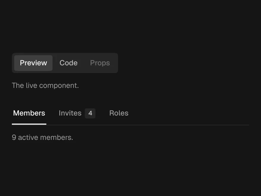
Tabs
FreeSegmented or underline tabs, with counts and disabled tabs.
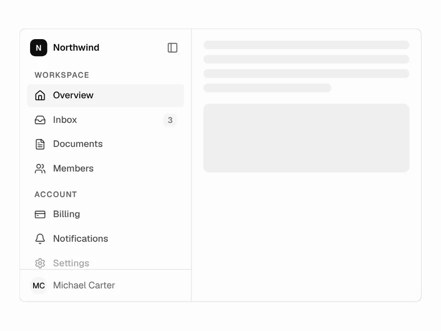
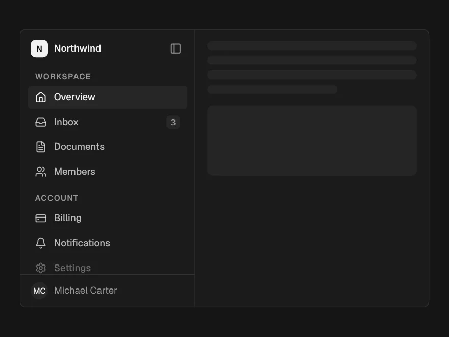
Sidebar
PaidApp navigation that collapses to an icon rail, with tooltips in the rail.
Included with lifetime access
Pagination
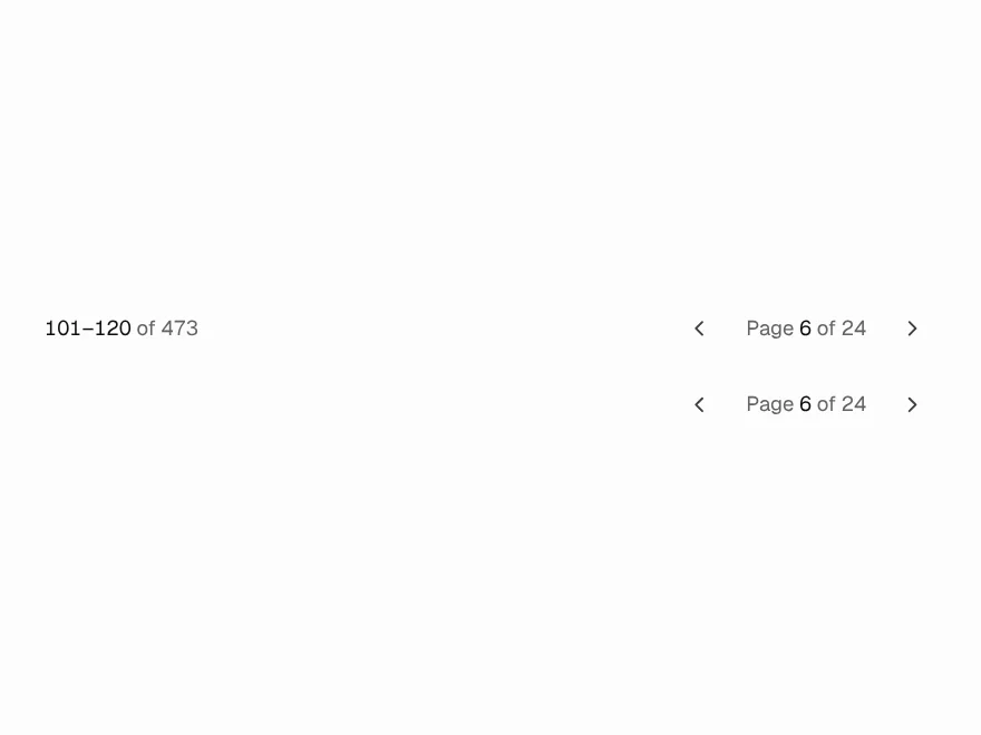
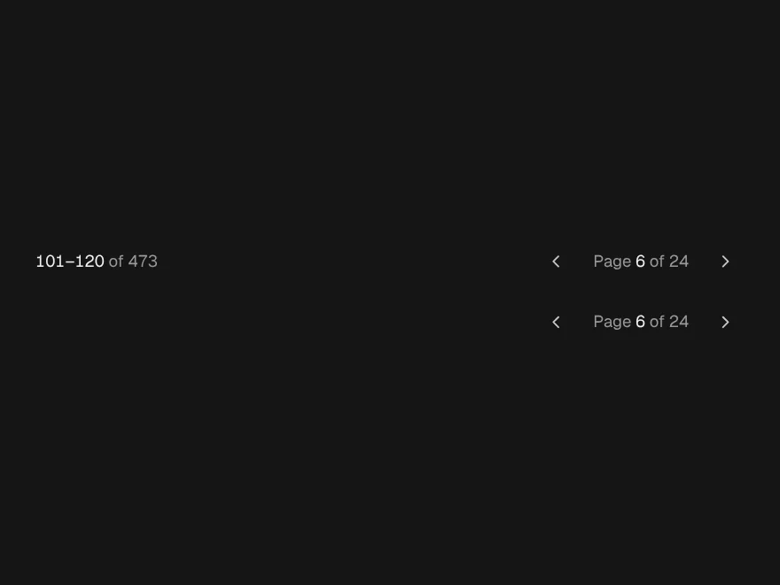
FreePage numbers with ellipses, a range summary, and a compact form for small screens.
Stepper & Wizard
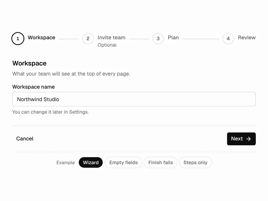
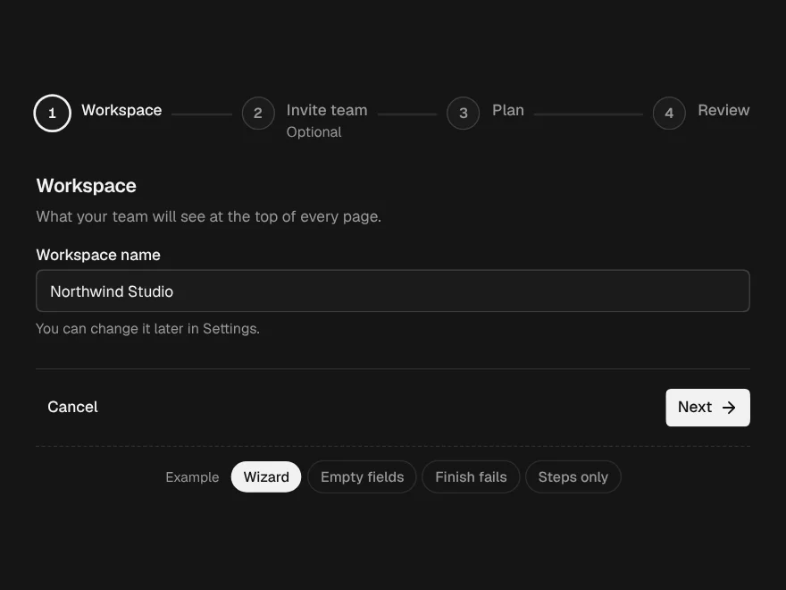
FreeSteps on their own, or a whole wizard with Back, Next, checks and a finish that can fail.
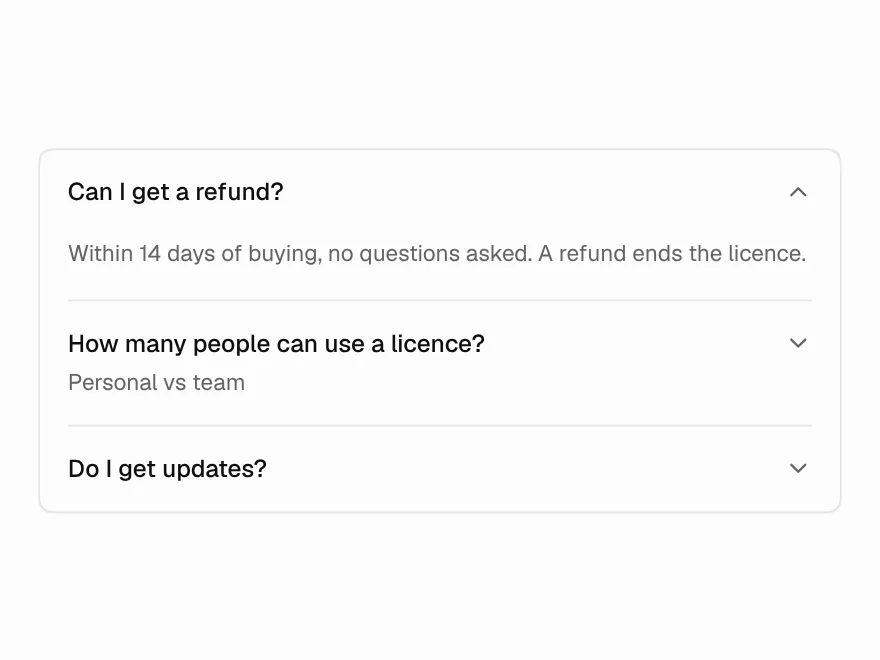
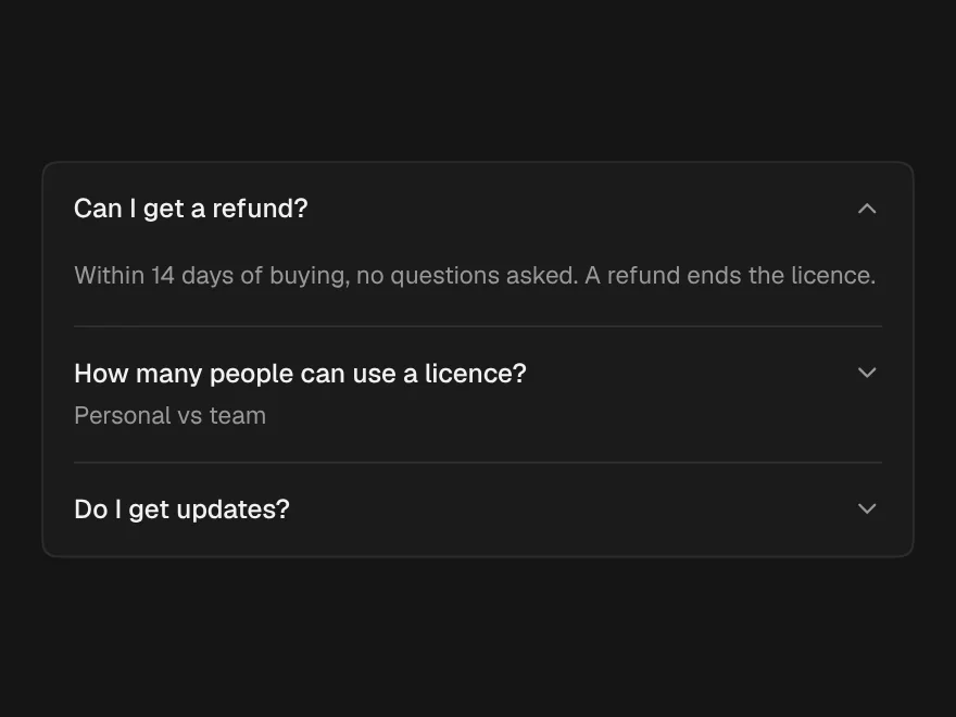
Accordion
FreeSingle or multiple sections that fold, plain or as cards.
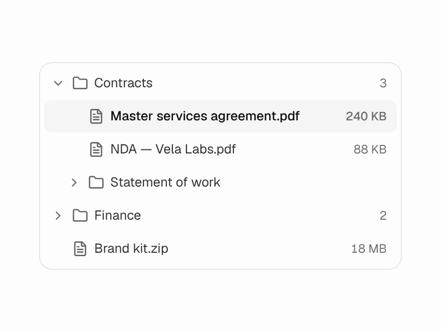
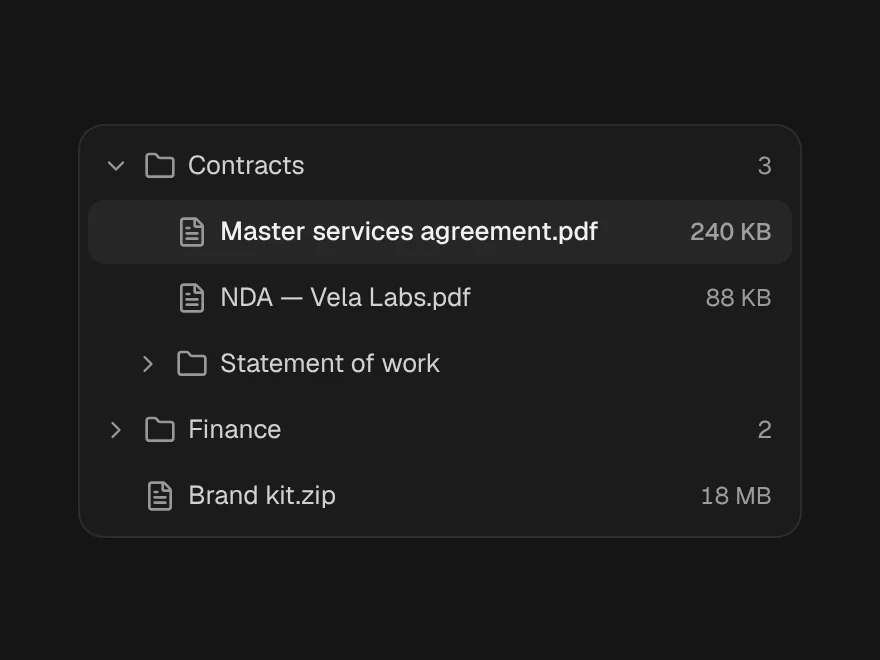
Tree View
FreeNested folders with the full ARIA tree keyboard model and typeahead.
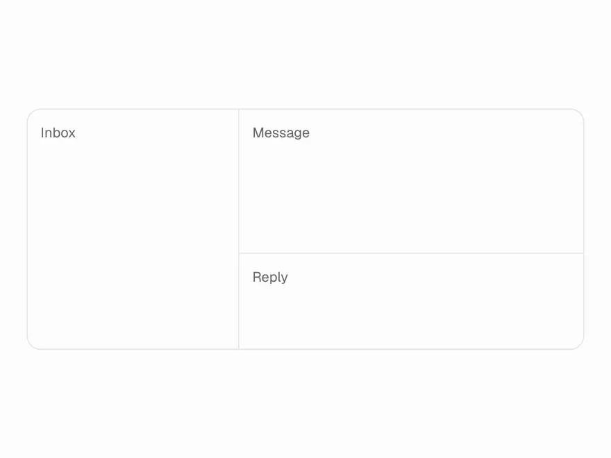
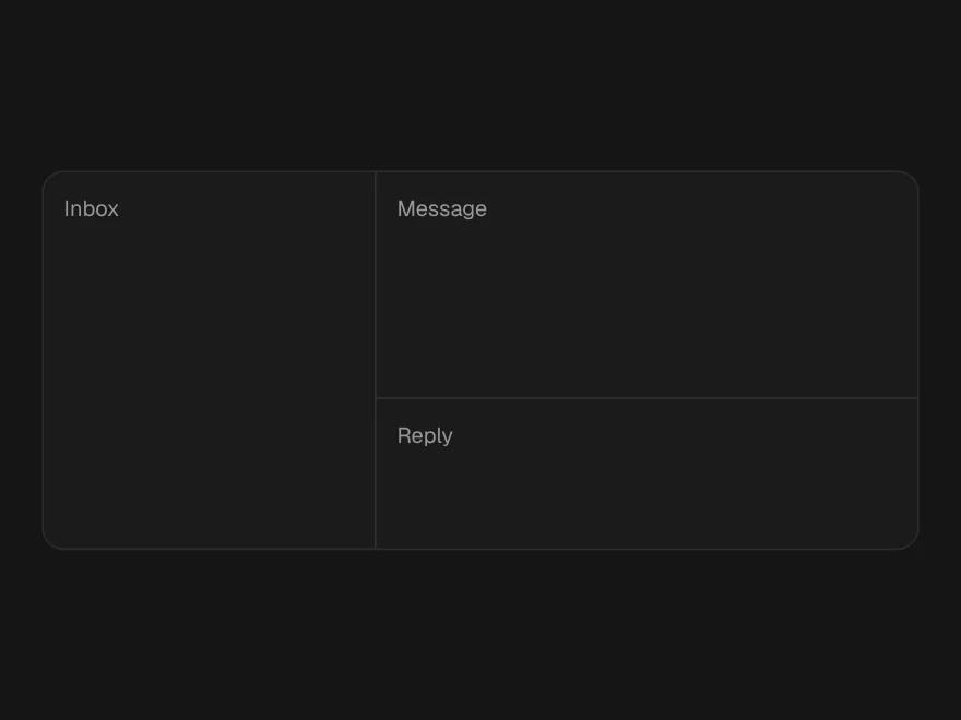
Resizable Panels
FreeSplit panes you can drag or resize with the keyboard, nested in either direction.