Dashboard
Pass the numbers you have and the grid closes up around them. One date range switches every panel; loading draws skeletons in the same shapes, an empty range says so and keeps the switch, and a failed load shows the reason with Try again. Built on the Layro charts, so every chart has a tooltip and a hidden data table.
Ready for AI tools one file typed props installs by name prompt included
Installation
How you get it
Paste this into Claude Code, Cursor, Codex or any coding agent. It installs the file and uses it as it is, instead of writing a new one.
Use Layro's Dashboard for this.
Install it: npx shadcn@latest add https://layropro.com/r/dashboard
Import it from @/components/ui/dashboard.
Do not rewrite or restyle it. Pass my data through its props
and keep its built-in states.
For the full brief with every prop and the mistakes assistants usually make, use Copy prompt above.
API
“Copy prompt” above puts a full brief on your clipboard — install command, dependencies, props, and the mistakes an assistant usually makes with this component.
Props
Read from the component’s own TypeScript interface when the site is built, so this table cannot drift from the file you install.
| Prop | Type | Notes |
|---|---|---|
title | React.ReactNode | — |
description | React.ReactNode | — |
ranges | DashboardRange[] | — |
range | string | — |
onRangeChange | (value: string) => void | — |
kpis | KpiCardProps[] | Up to four read best; more wrap. |
trend | CartesianPanel | The wide chart. |
breakdown | { | Parts of a whole, beside the trend. |
titlerequired | string | — |
subtitle | string | — |
datarequired | DonutSlice[] | — |
format | (v: number) => string | — |
centerLabel | string | — |
descriptionrequired | string | — |
compare | CartesianPanel | Bars comparing periods or groups. |
ranking | { title: string; subtitle?: string; items: DashboardRankItem[] } | A ranked list with a bar each: top customers, pages, plans. |
actions | React.ReactNode | Something extra in the header, beside the range switch. |
loading | boolean | — |
error | React.ReactNode | Replaces the panels with the reason. |
onRetry | () => void | — |
empty | boolean | No data in this range. |
Dependencies
npm packages
clsxframer-motionlucide-reacttailwind-mergeLayro foundations, installed alongside it
layro-themebuttonchartprogresssegmented-controlstateLifetime access
Every component, and everything we ship next.
- All 112 components, source included
- The template, and everything released after you buy
- shadcn CLI or download — React 18/19, Tailwind v4
- One payment. No subscription.
More in Data & feedback
All Data & feedback components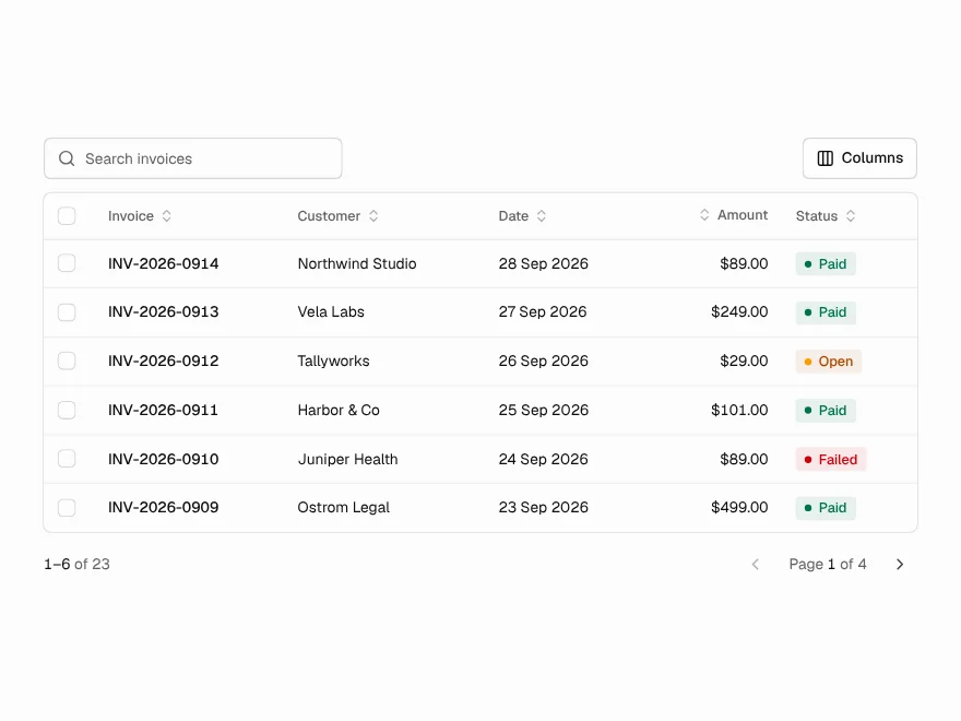
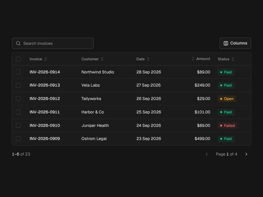
Data Table
FreeTanStack table with sorting, search, row selection, bulk actions, column toggle and pagination.
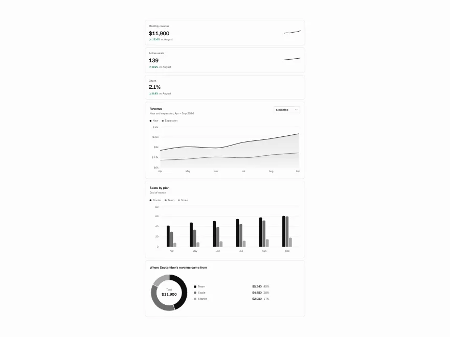
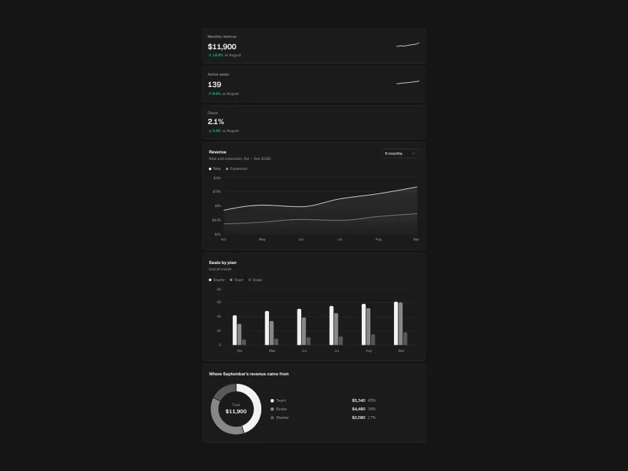
Charts
FreeArea, bar and donut charts, KPI cards and sparklines, each with a data table for screen readers.
Badge
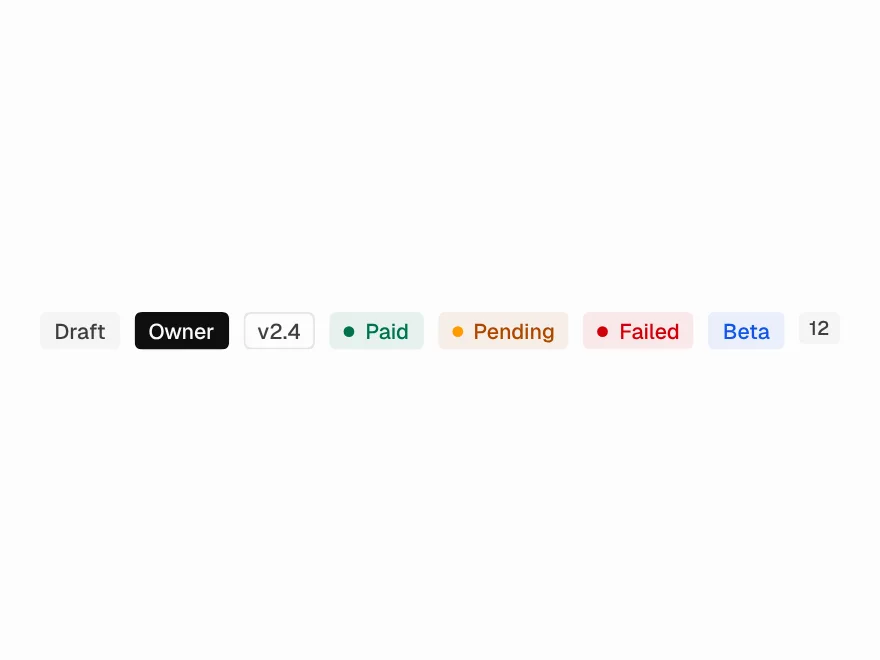
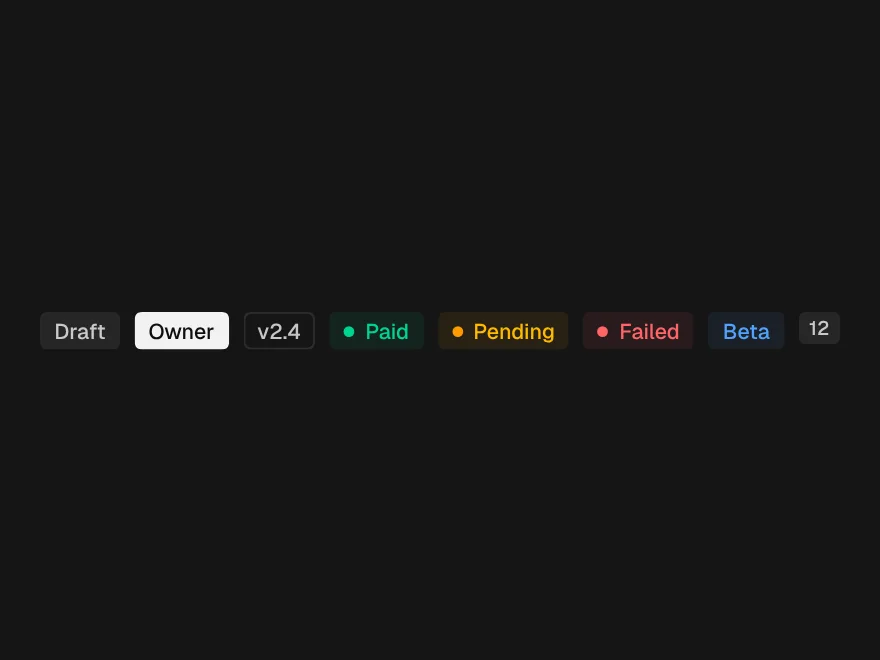
FreeStatus labels in seven tones with an optional dot.
Empty & Loading States
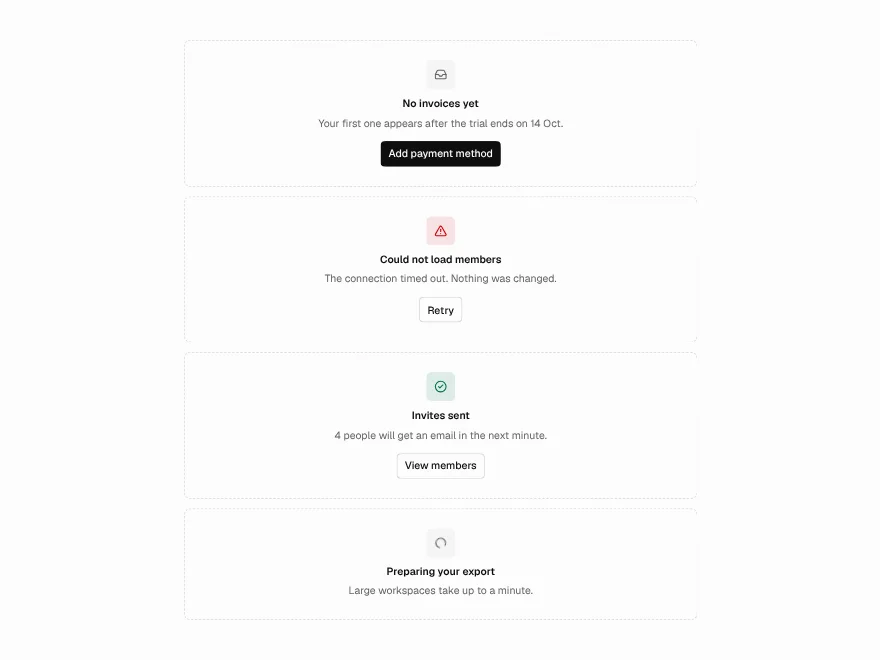
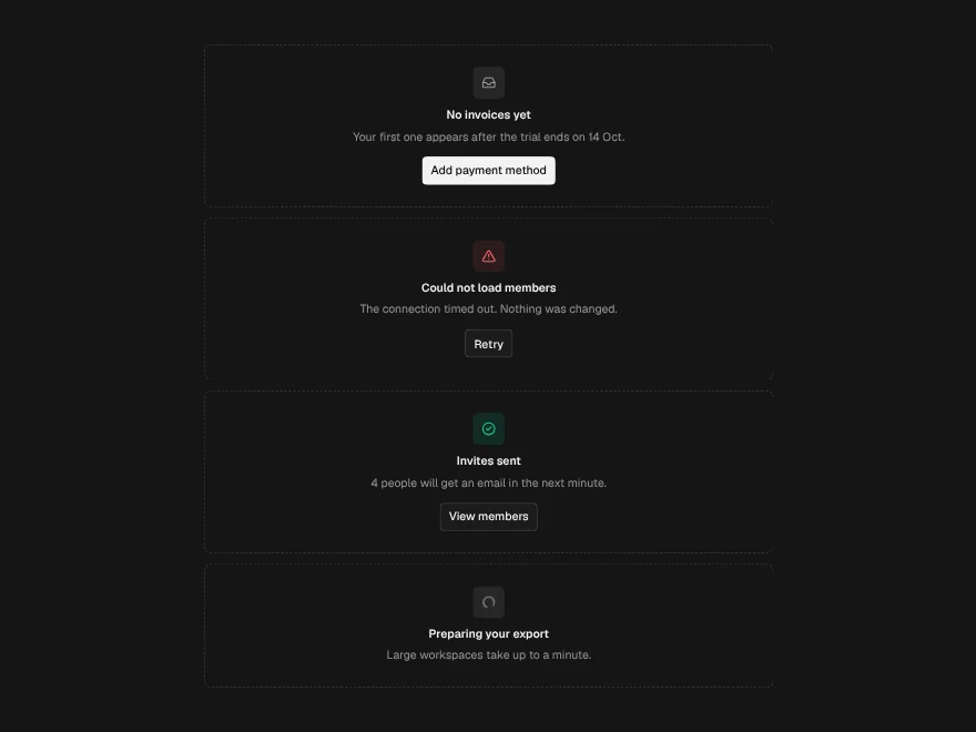
FreeEmpty, error, success and loading states, plus skeletons.
Alert
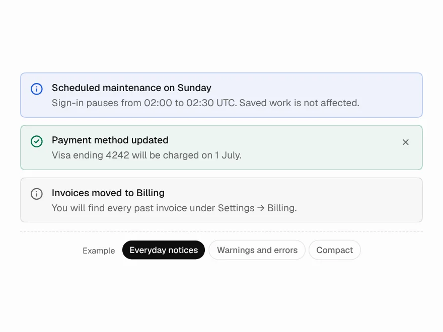
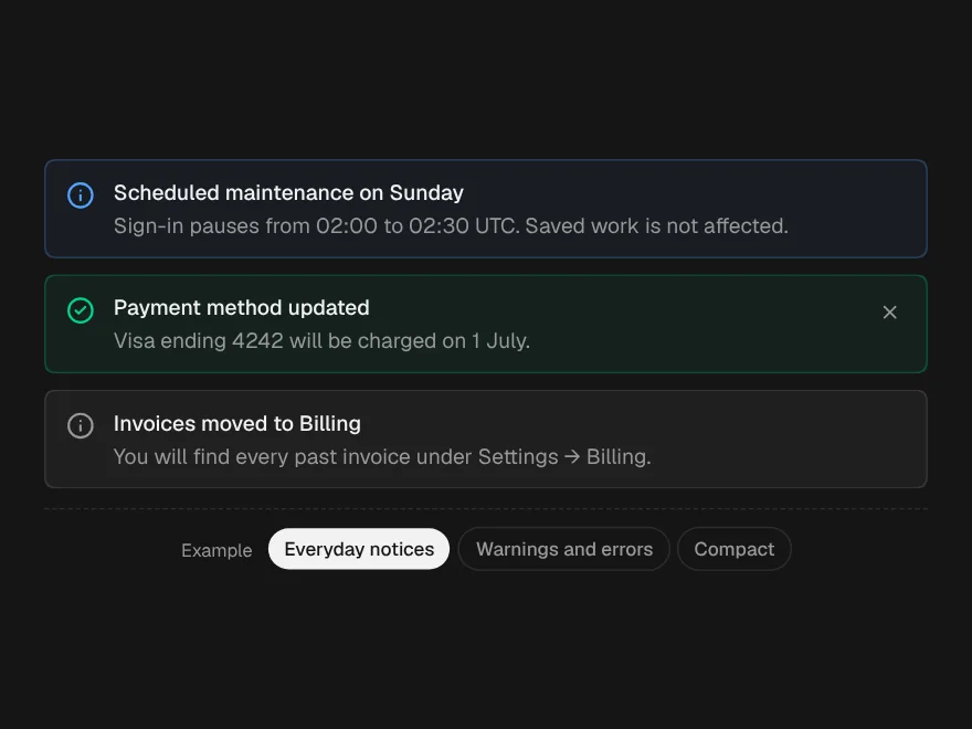
FreeAn inline notice in five tones, with one action and an optional close.
Progress Bar
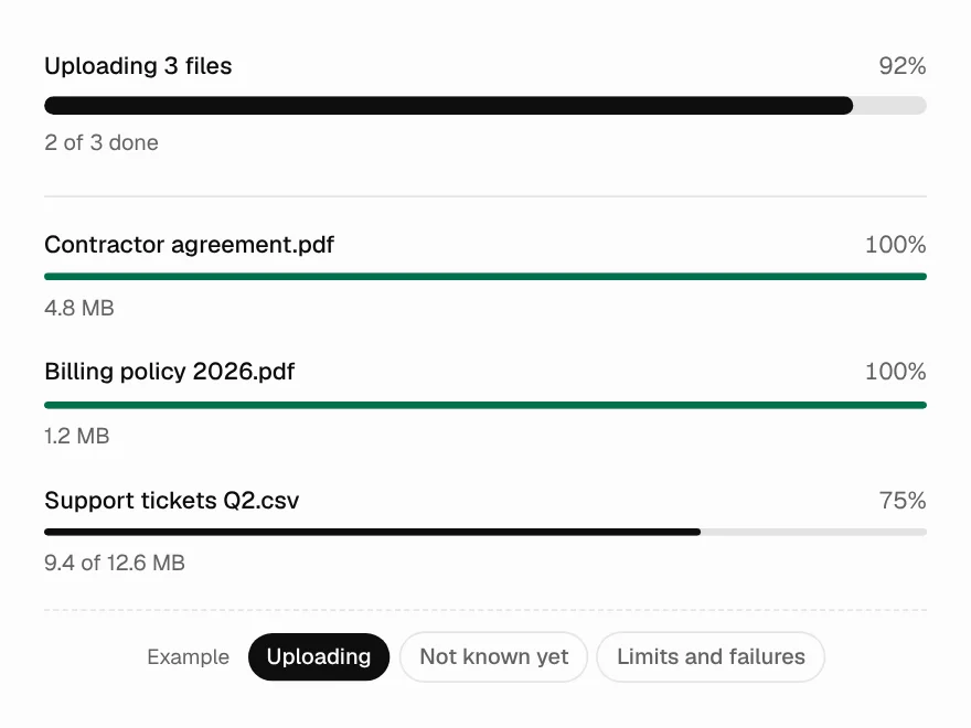
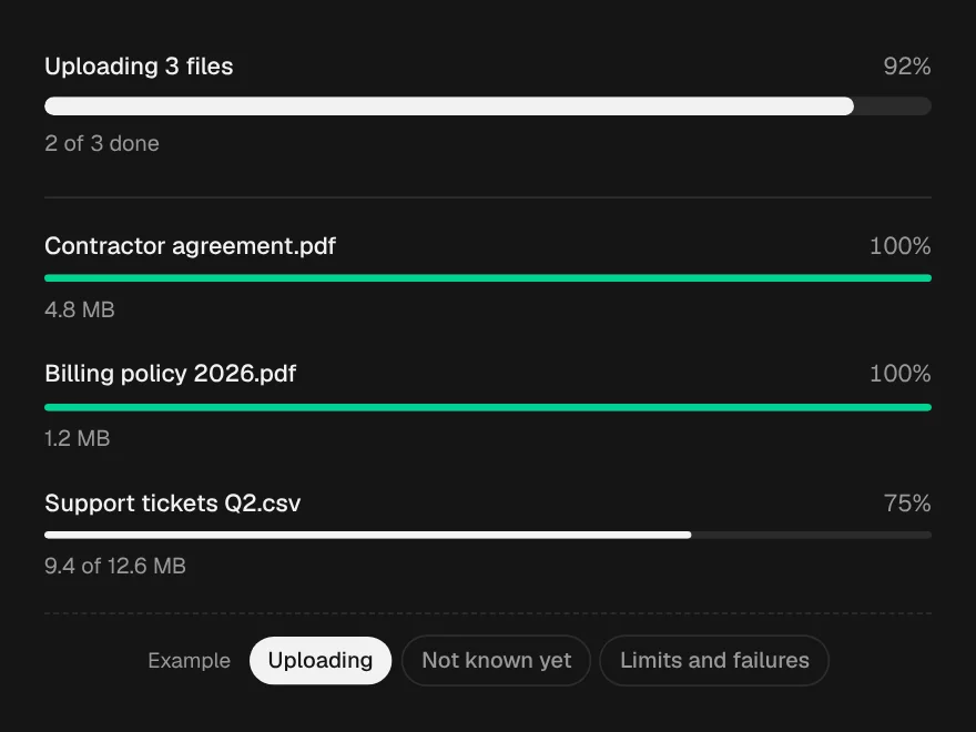
FreeA progress bar, determinate or not, grey until colour means something.