Expand Gallery
Click a tile and its picture grows out of the grid into a full view with the story beside it; arrow keys move through the set, and closing returns to the tile you ended on. Images or any CSS background as artwork.
Ready for AI tools one file typed props installs by name prompt included
The decision inside it
It opens from where it sits
The tile and the full view are one element in two layouts, so the picture flies from its place and the reader never loses what they clicked. It is a proper dialog: focus trapped, Escape and backdrop close it, focus returns to the tile. Reduced motion fades instead.
Installation
How you get it
Paste this into Claude Code, Cursor, Codex or any coding agent. It installs the file and uses it as it is, instead of writing a new one.
Use Layro's Expand Gallery for this.
Install it: npx shadcn@latest add @layro/expand-gallery
(the @layro registry is set up in components.json, with LAYRO_KEY in .env.local)
Import it from @/components/ui/expand-gallery.
Do not rewrite or restyle it. Pass my data through its props
and keep its built-in states.
For the full brief with every prop and the mistakes assistants usually make, use Copy prompt above. Free components install through the @layro registry with your CLI token: see the Namespaced tab.
When to use it
Use Expand Gallery for a set of projects or photos where any item opens in place into a full view with details, then steps through the rest.
Usage
import { ExpandGallery, type GalleryItem } from "@/components/ui/expand-gallery";

const items: GalleryItem[] = [
  { id: "salt", title: "Casa Sal", category: "Residential", src: "/work/casa-sal.jpg", alt: "A white house on an ochre hill" },
  { id: "curve", title: "The Long Curve", category: "Cultural", src: "/work/curve.jpg", alt: "A curved white wall" },
];

export function Projects() {
  return <ExpandGallery items={items} columns={3} />;
}
API
“Copy prompt” above puts a full brief on your clipboard — install command, dependencies, props, and the mistakes an assistant usually makes with this component.
Props
Read from the component’s own TypeScript interface when the site is built, so this table cannot drift from the file you install.
| Prop | Type | Notes |
|---|---|---|
itemsrequired | GalleryItem[] | — |
columns | number | Columns at full width. Default 3. |
rowHeight | number | Height of one grid row, in px. Default 190. |
Dependencies
npm packages
clsxframer-motionlucide-reacttailwind-mergeLayro foundations, installed alongside it
layro-themeLifetime access
Every component, and everything we ship next.
- All 132 components, source included
- Every template, and everything released after you buy
- shadcn CLI or download — React 18/19, Tailwind v4
- One payment. No subscription.
More in Creative
All Creative components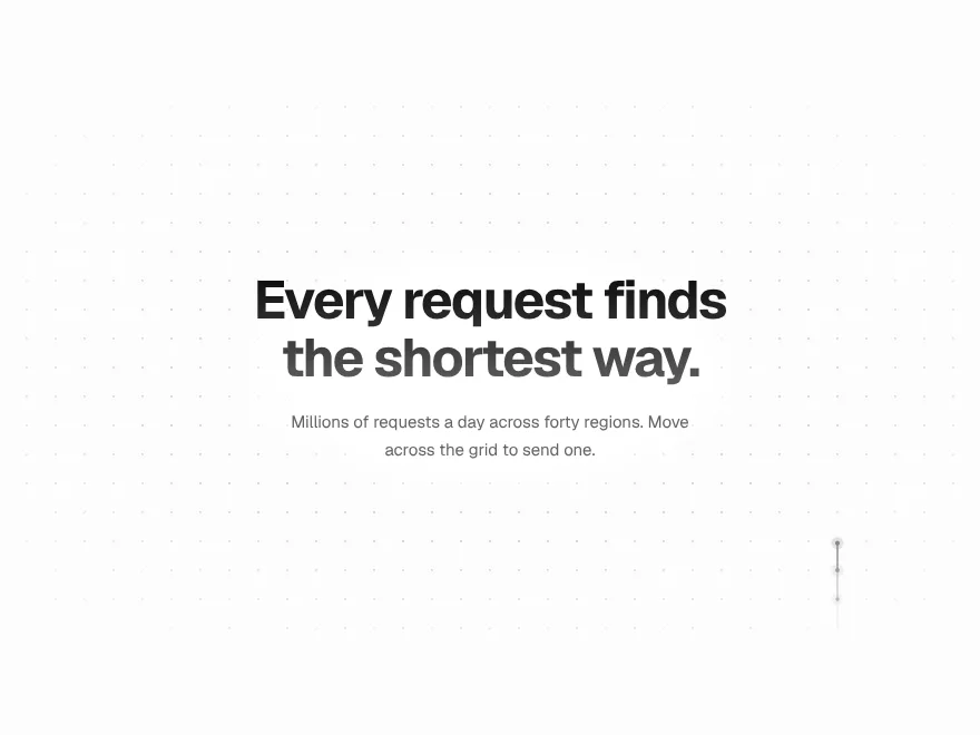

Signal Grid
FreeA dot grid that carries signals: move across it and pulses travel the lines.
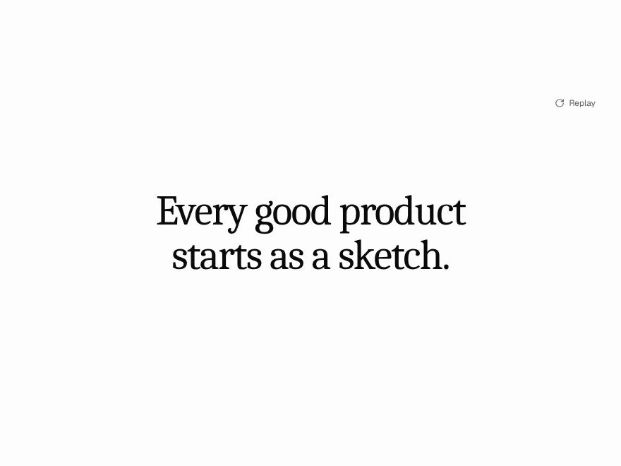

Ink Bleed Heading
FreeA heading that arrives like ink on wet paper, word by word.
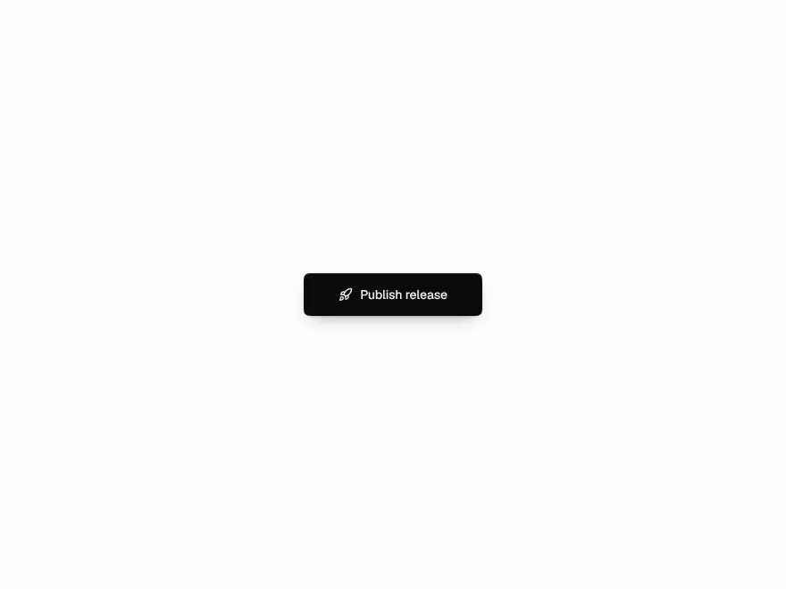
Pressure Button
FreeSinks under the press, gathers while held, releases with a ripple.
Scroll Thread
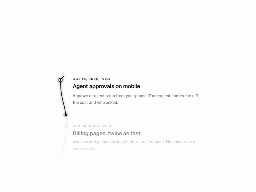
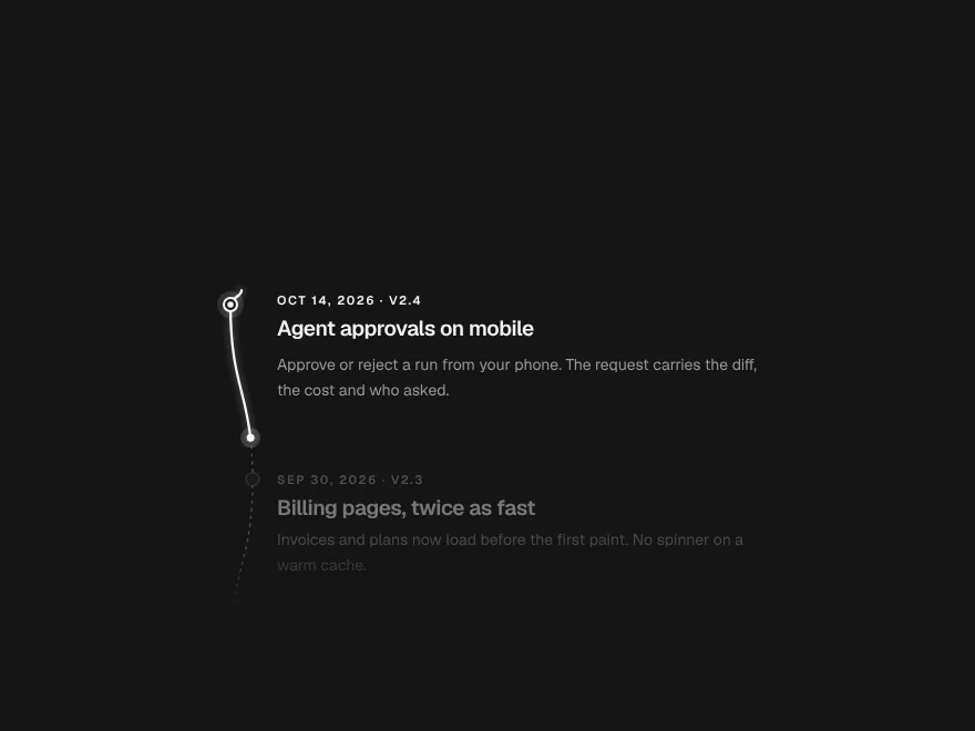
FreeOne line that draws through the page and lights each step as it arrives.
Orbit Stack
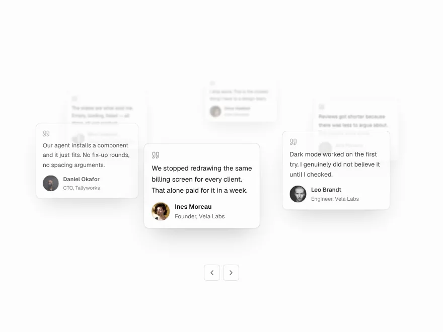
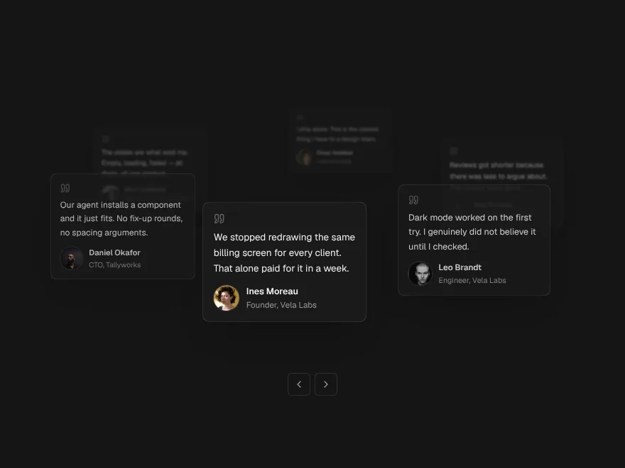
FreeTestimonial cards on a slow orbit around your headline.
Agent Orb
FreeOne living shape for a voice assistant: idle, listening, thinking, speaking.