Morph Tabs
The indicator's leading edge reaches ahead and the trailing edge catches up, so it stretches and settles into each tab. The panel slides in from the side the tab came from. Controlled or uncontrolled, with icons.
Ready for AI tools one file typed props installs by name prompt included
The decision inside it
Two edges, two springs
Each edge of the indicator gets its own spring per move, the one in the direction of travel quicker, which is what makes it stretch, for tabs of any width. It is a real tablist: arrows, Home and End, labelled panels. Reduced motion swaps without travel.
Installation
How you get it
Paste this into Claude Code, Cursor, Codex or any coding agent. It installs the file and uses it as it is, instead of writing a new one.
Use Layro's Morph Tabs for this.
Install it: npx shadcn@latest add @layro/morph-tabs
(the @layro registry is set up in components.json, with LAYRO_KEY in .env.local)
Import it from @/components/ui/morph-tabs.
Do not rewrite or restyle it. Pass my data through its props
and keep its built-in states.
For the full brief with every prop and the mistakes assistants usually make, use Copy prompt above. Free components install through the @layro registry with your CLI token: see the Namespaced tab.
When to use it
Use Morph Tabs for a few views of the same thing where the switch should feel connected: the pill stretches between tabs and the content slides the same way.
Usage
import { MorphTabs } from "@/components/ui/morph-tabs";

export function OverviewTabs() {
  return (
    <MorphTabs
      tabs={[
        { id: "overview", label: "Overview", content: <p>Three launches this week.</p> },
        { id: "revenue", label: "Revenue", content: <p>$84,200 invoiced in October.</p> },
      ]}
    />
  );
}
API
“Copy prompt” above puts a full brief on your clipboard — install command, dependencies, props, and the mistakes an assistant usually makes with this component.
Props
Read from the component’s own TypeScript interface when the site is built, so this table cannot drift from the file you install.
| Prop | Type | Notes |
|---|---|---|
tabsrequired | MorphTab[] | — |
value | string | — |
defaultValue | string | — |
onValueChange | (id: string) => void | — |
Dependencies
npm packages
clsxframer-motiontailwind-mergeLayro foundations, installed alongside it
layro-themeLifetime access
Every component, and everything we ship next.
- All 132 components, source included
- Every template, and everything released after you buy
- shadcn CLI or download — React 18/19, Tailwind v4
- One payment. No subscription.
More in Creative
All Creative components
Expand Gallery
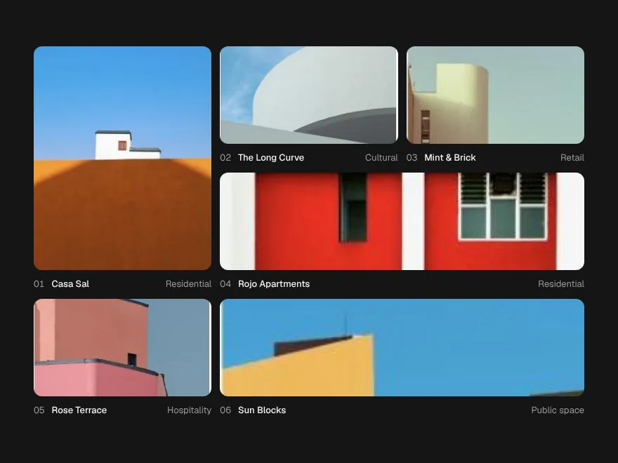
FreeGrid tiles that open in place into a full view, and shrink back.


Signal Grid
FreeA dot grid that carries signals: move across it and pulses travel the lines.


Ink Bleed Heading
FreeA heading that arrives like ink on wet paper, word by word.

Pressure Button
FreeSinks under the press, gathers while held, releases with a ripple.
Scroll Thread
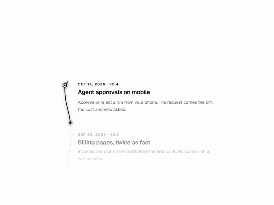
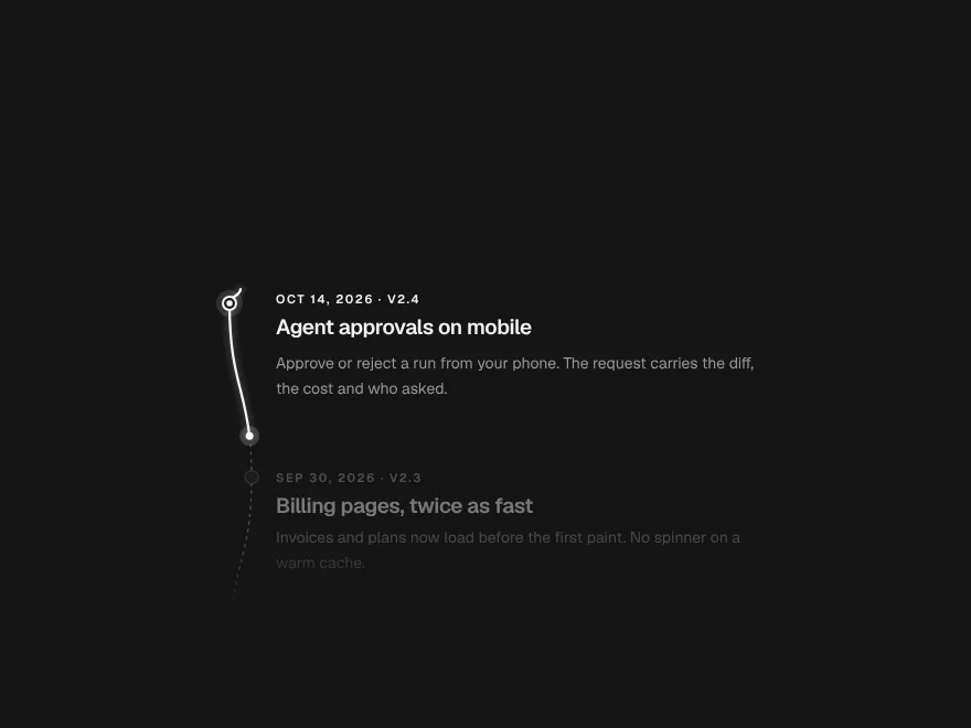
FreeOne line that draws through the page and lights each step as it arrives.

Orbit Stack
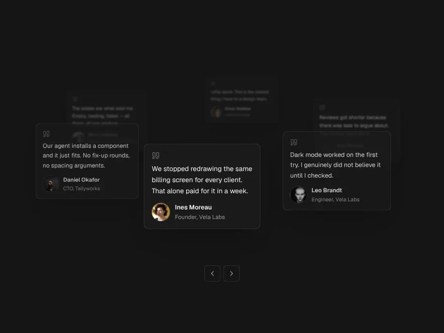
FreeTestimonial cards on a slow orbit around your headline.