Calendar Heatmap
Each day a square in a week column, shaded in five steps cut at the quartiles of active days. Arrow keys move day by day and a line under the grid says the date and count. Current and longest streak, active days and the total sit above.
The decision inside it
Quartiles, not a smooth ramp
One huge day on a smooth ramp turns every other day the same pale shade. Cutting levels at the quartiles keeps an ordinary week readable.
When to use it
Use Calendar Heatmap for a year of daily counts as week columns with month labels, five levels and streak stats (current, longest, active days, total). Dates are YYYY-MM-DD strings.
Installation
How you get it
Paste this into Claude Code, Cursor, Codex or any coding agent. It installs the file and uses it as it is, instead of writing a new one.
Use Layro's Calendar Heatmap for this.
Install it: npx shadcn@latest add @layro/calendar-heatmap
(the @layro registry is set up in components.json, with LAYRO_KEY in .env.local)
Import it from @/components/ui/calendar-heatmap.
Do not rewrite or restyle it. Pass my data through its props
and keep its built-in states.
For the full brief with every prop and the mistakes assistants usually make, use Copy prompt above. Pro components install through the @layro registry with your CLI token: see the Namespaced tab.
Usage
import { CalendarHeatmap, type DayValue } from "@/components/ui/calendar-heatmap";

export function Activity({ days }: { days: DayValue[] }) {
  return <CalendarHeatmap values={days} label="documents signed" description="Documents signed per day, last 12 months" />;
}
API reference
“Copy prompt” above puts a full brief on your clipboard — install command, dependencies, props, and the mistakes an assistant usually makes with this component.
Props
Read from the component’s own TypeScript interface when the site is built, so this table cannot drift from the file you install.
| Prop | Type | Notes |
|---|---|---|
valuesrequired | DayValue[] | — |
end | string | Last day shown, "YYYY-MM-DD". Default: the latest date in `values`. |
weeks | number | Weeks shown. Default 53 (a year). |
weekStart | "monday" | "sunday" | Week starts on. Default "monday". |
label | string | What is counted, plural: "documents signed". |
stats | boolean | Show the streak stats above the grid. Default true. |
descriptionrequired | string | Accessible summary. |
loading | boolean | — |
error | React.ReactNode | — |
onRetry | () => void | — |
className | string | — |
Dependencies
npm packages
clsxtailwind-mergeLayro foundations, installed alongside it
layro-themechartStates
All of them are drawn by the component. None is left for you to design.
- Default
- Weeks from Sunday
- Loading
- Empty
- Error
Accessibility
- Keyboard reachable throughout, in visual order
- Focus trapped in overlays, Escape closes them
- Focus returns to whatever opened it
- Live regions announce what changed, not that something did
- Honours prefers-reduced-motion
Responsive behavior
- Sizes to its container, not the viewport
- Usable from 320px up
- Pointer-based interaction, so trackpad and touch both work
- No hover-only affordances
Lifetime access
Every component, and everything we ship next.
- All 232 components, source included
- Every template, and everything released after you buy
- shadcn CLI or download — React 18/19, Tailwind v4
- One payment. No subscription.
More in Data & feedbackAll Data & feedback components
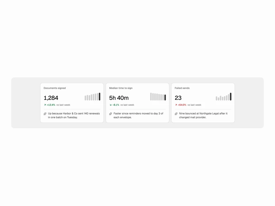
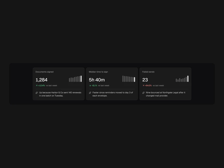
Insight Cards
A number, how it moved and one line on why: spark bars, a trend delta and a short AI explanation.
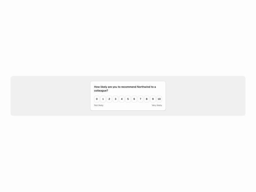
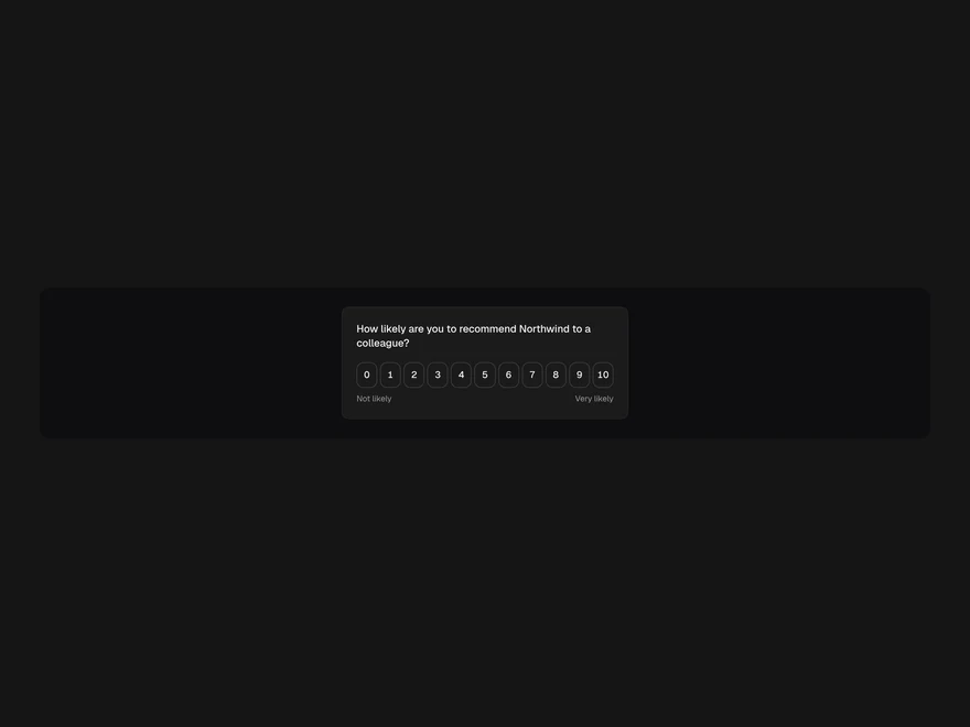
Feedback Widget
One question with an NPS, emoji, thumbs or star scale, an optional comment and a thank-you. Inline or floating.
Badge
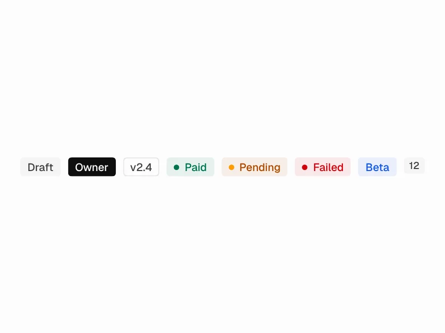
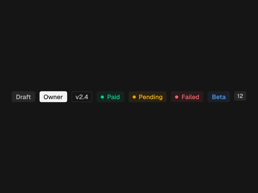
Status labels in seven tones with an optional dot.
Empty States
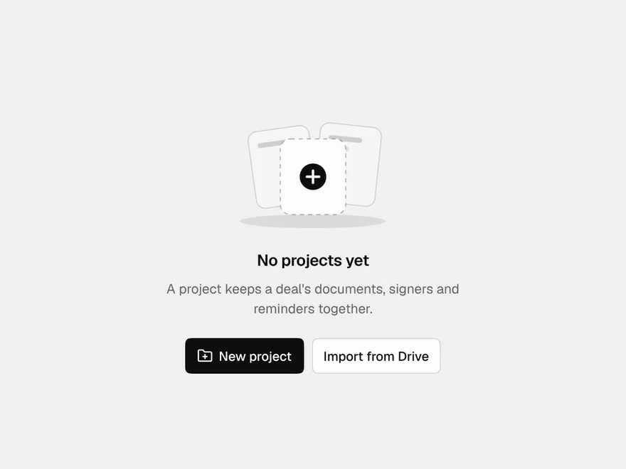
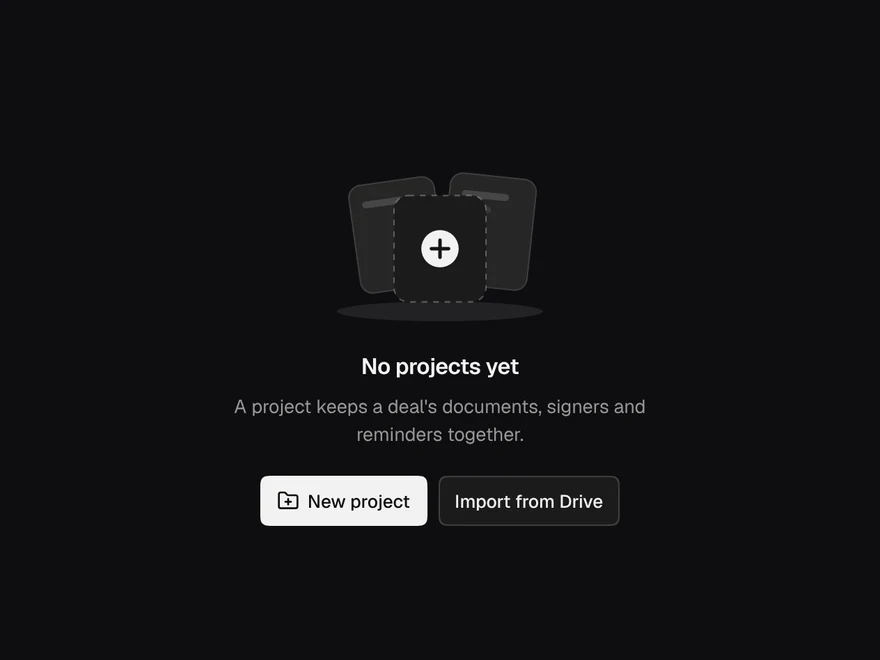
Seven drawn empty states: no projects, no results, inbox zero, no data, no agents, locked, 404.
Empty & Loading States
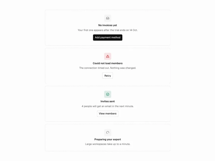
Empty, error, success and loading states, plus skeletons.
Alert
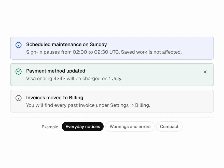
An inline notice in five tones, with one action and an optional close.