Liquid Glass
An SVG displacement filter used as a backdrop filter leaves the centre clear and bends the rim. Where the browser cannot do that, it falls back to frosted glass or a solid card.
The decision inside it
Never a clear hole
Only Chromium can bend the backdrop, so other browsers get frosted glass or the card colour, and the text on it stays readable.
When to use it
Use Liquid Glass for a small floating surface over a photo or video: a player, a toolbar, a badge. It falls back to frosted glass outside Chromium. For a readable panel of text, use a card.
Installation
How you get it
Paste this into Claude Code, Cursor, Codex or any coding agent. It installs the file and uses it as it is, instead of writing a new one.
Use Layro's Liquid Glass for this.
Install it: npx shadcn@latest add @layro/liquid-glass
(the @layro registry is set up in components.json, with LAYRO_KEY in .env.local)
Import it from @/components/ui/liquid-glass.
Do not rewrite or restyle it. Pass my data through its props
and keep its built-in states.
For the full brief with every prop and the mistakes assistants usually make, use Copy prompt above. Pro components install through the @layro registry with your CLI token: see the Namespaced tab.
Usage
import { LiquidGlass } from "@/components/ui/liquid-glass";

export function NowPlaying() {
  return (
    <LiquidGlass radius={999} className="px-5 py-3 font-semibold">
      Weekly signing digest
    </LiquidGlass>
  );
}
API reference
“Copy prompt” above puts a full brief on your clipboard — install command, dependencies, props, and the mistakes an assistant usually makes with this component.
Props
Read from the component’s own TypeScript interface when the site is built, so this table cannot drift from the file you install.
| Prop | Type | Notes |
|---|---|---|
children | React.ReactNode | — |
blur | number | Blur of what is behind, in pixels. Keep it low so it reads as glass, not frost. Default 1. |
refraction | number | How strongly the rim bends the picture, 0 to 1. Default 0.5. |
tint | string | A CSS colour laid over the glass. Default the card colour at 16%. |
radius | number | Corner radius, in pixels. Default 24. |
fallback | "frosted" | "solid" | What browsers without SVG backdrop filters get. Default "frosted". |
Dependencies
npm packages
clsxtailwind-mergeLayro foundations, installed alongside it
layro-themeStates
All of them are drawn by the component. None is left for you to design.
- Pill
- Card
- Strong bend
- Frosted fallback
- Solid fallback
Accessibility
- Keyboard reachable throughout, in visual order
- Focus trapped in overlays, Escape closes them
- Focus returns to whatever opened it
- Live regions announce what changed, not that something did
- Honours prefers-reduced-motion
Responsive behavior
- Sizes to its container, not the viewport
- Usable from 320px up
- Pointer-based interaction, so trackpad and touch both work
- No hover-only affordances
Lifetime access
Every component, and everything we ship next.
- All 232 components, source included
- Every template, and everything released after you buy
- shadcn CLI or download — React 18/19, Tailwind v4
- One payment. No subscription.
More in CreativeAll Creative components
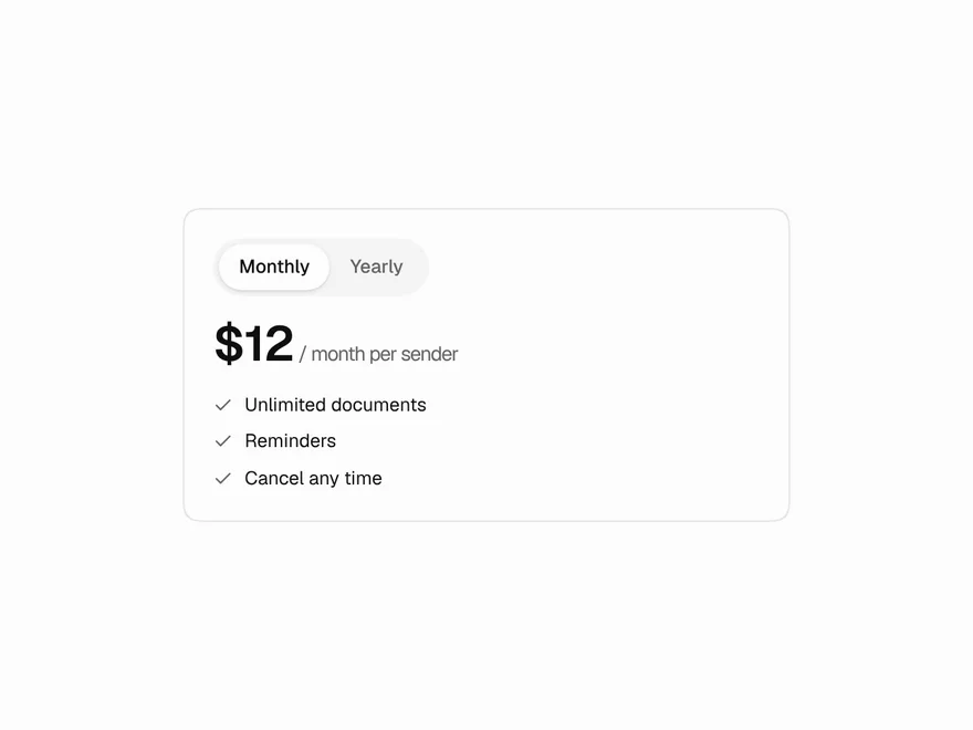
Blur Crossfade
Swaps content through a soft blur and eases the box to the new height.
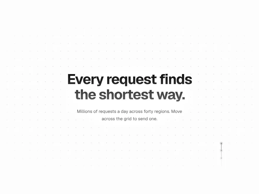
Signal Grid
A dot grid that carries signals: move across it and pulses travel the lines.


Ink Bleed Heading
A heading that arrives like ink on wet paper, word by word.
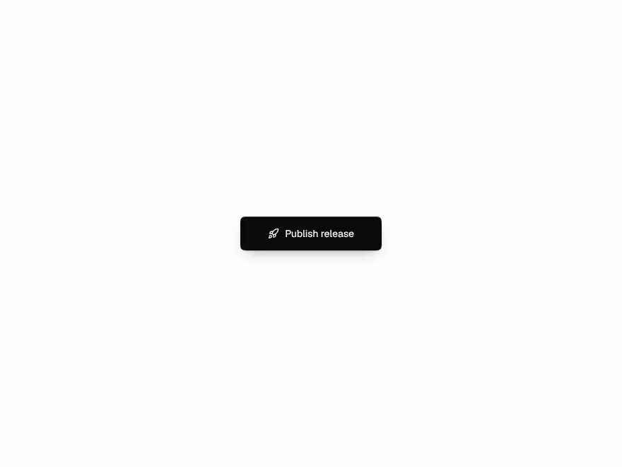
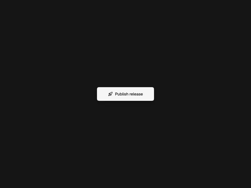
Pressure Button
Sinks under the press, gathers while held, releases with a ripple.
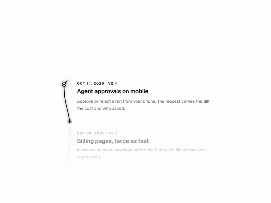
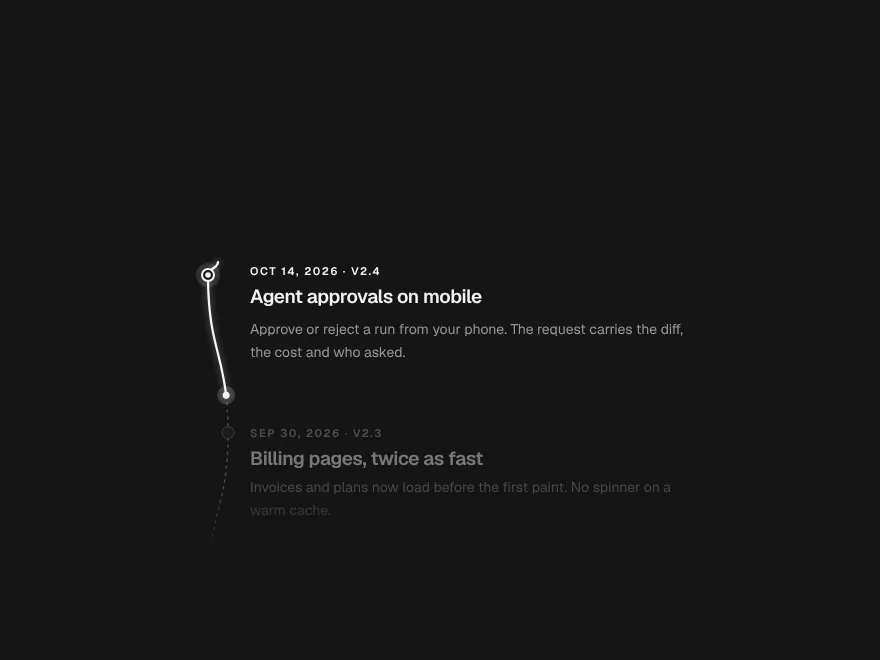
Scroll Thread
One line that draws through the page and lights each step as it arrives.
Orbit Stack
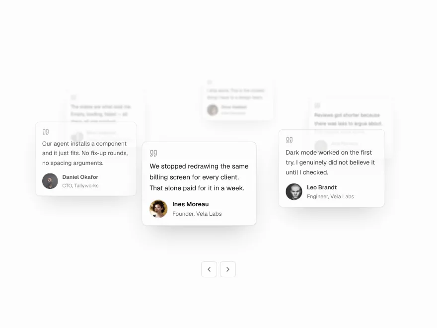
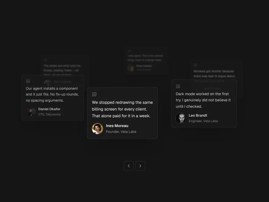
Testimonial cards on a slow orbit around your headline.