Expandable Card
The picture and title fly from the card into the open view. Over the page it is a real dialog: focus is trapped, Escape and the backdrop close it, and focus returns to the card. In place it grows and pushes the rest down.
The decision inside it
Two ways to open
Case studies open over the page so the story has room; an FAQ grows in place so the reader keeps their spot in the list.
When to use it
Use Expandable Card for a list or grid of short cards that open into more: case studies open over the page, an FAQ grows in place. For a photo gallery use Expand Gallery.
Installation
How you get it
Paste this into Claude Code, Cursor, Codex or any coding agent. It installs the file and uses it as it is, instead of writing a new one.
Use Layro's Expandable Card for this.
Install it: npx shadcn@latest add @layro/expandable-card
(the @layro registry is set up in components.json, with LAYRO_KEY in .env.local)
Import it from @/components/ui/expandable-card.
Do not rewrite or restyle it. Pass my data through its props
and keep its built-in states.
For the full brief with every prop and the mistakes assistants usually make, use Copy prompt above. Pro components install through the @layro registry with your CLI token: see the Namespaced tab.
Usage
import { ExpandableCard } from "@/components/ui/expandable-card";

export function Faq() {
  return (
    <ExpandableCard
      layout="list"
      expandMode="inline"
      items={[
        { id: "legal", title: "Are e-signatures legally binding?", content: <p>Yes, in the US, UK and EU.</p> },
        { id: "app", title: "Do signers need an account?", content: <p>No. They open the link and sign.</p> },
      ]}
    />
  );
}
API reference
“Copy prompt” above puts a full brief on your clipboard — install command, dependencies, props, and the mistakes an assistant usually makes with this component.
Props
Read from the component’s own TypeScript interface when the site is built, so this table cannot drift from the file you install.
| Prop | Type | Notes |
|---|---|---|
itemsrequired | ExpandableItem[] | — |
layout | "list" | "grid" | A single column or a grid. Default "list". |
expandMode | "modal" | "inline" | Open over the page ("modal") or grow in place ("inline"). Default "modal". |
openId | string | null | The open card's id, when you control it. |
onOpenChange | (id: string | null) => void | Called with the id that opened, or null on close. |
Dependencies
npm packages
clsxframer-motionlucide-reacttailwind-mergeLayro foundations, installed alongside it
layro-themeStates
All of them are drawn by the component. None is left for you to design.
- Grid
- List
- Open over the page
- Open in place
- Reduced motion
Accessibility
- Keyboard reachable throughout, in visual order
- Focus trapped in overlays, Escape closes them
- Focus returns to whatever opened it
- Live regions announce what changed, not that something did
- Honours prefers-reduced-motion
Responsive behavior
- Sizes to its container, not the viewport
- Usable from 320px up
- Pointer-based interaction, so trackpad and touch both work
- No hover-only affordances
Lifetime access
Every component, and everything we ship next.
- All 232 components, source included
- Every template, and everything released after you buy
- shadcn CLI or download — React 18/19, Tailwind v4
- One payment. No subscription.
More in MarketingAll Marketing components


Globe / World Map
The world in dots, as a turning globe or a flat map, with places marked and arcs between them.
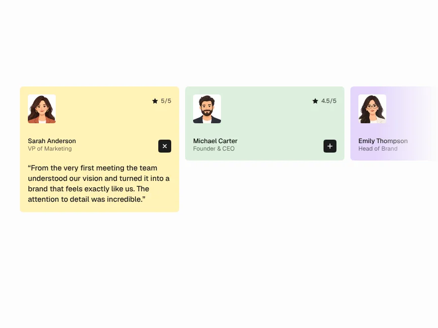
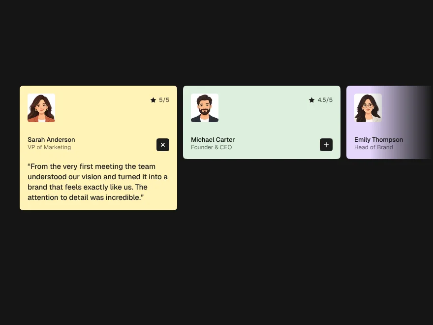
Testimonial Section
An accordion of quotes where one is always open.


Scroll Fill Text
A line that fills in as it is read, character by character.
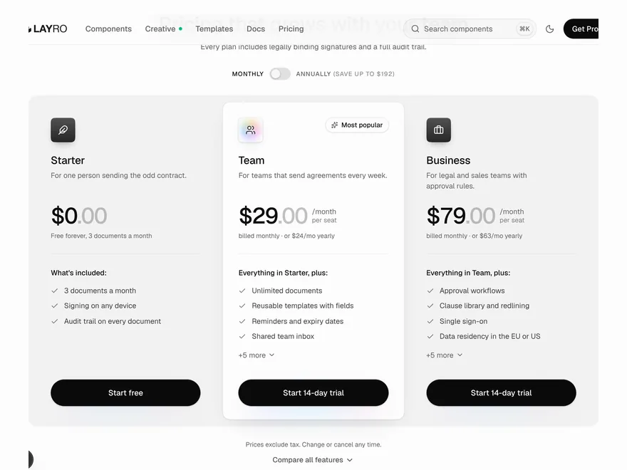
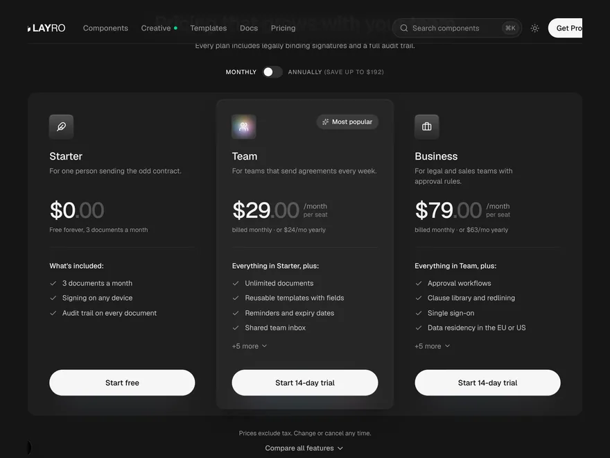
Pricing Plans
The pricing section of a landing page, with an honest annual saving.


Terminal
A terminal window that types commands and prints their output, for docs and landing pages.
Announcement Banner
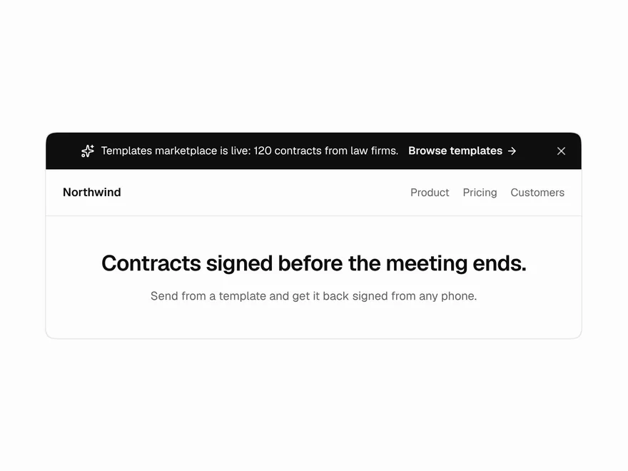
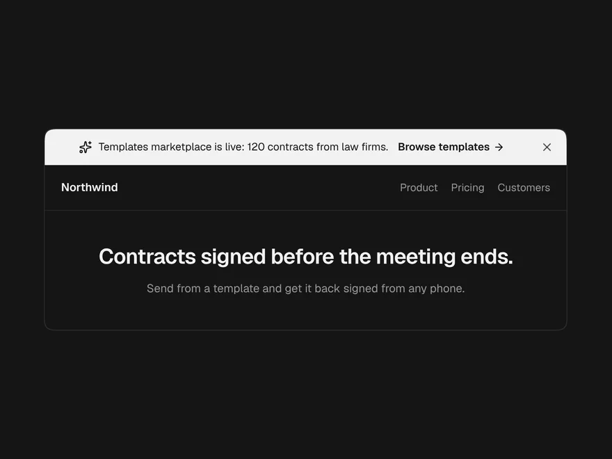
A one-line strip across the top of a site for a launch, a notice or maintenance.